In this article
Understanding cycle time
Imagine you're running a food truck. Your cycle time would be how long it takes from the moment a customer orders a burger to when you hand it over, all hot and delicious. If you can make that burger faster without sacrificing quality, you'll have happier customers, serve more people, and probably make more money.
Now, replace "burger" with "software feature," and you've got the idea of why cycle time matters in Agile development.
One of our clients put it perfectly: "If you work in a factory, work in progress is obvious: you see workers and queues of cars in a factory. You see things piling up and not getting through. But because intellectual work in software development is hidden in systems, you have to make it visible. If you can't see it, you tolerate it, you ignore it."
Jira's native cycle time charts: pros and cons
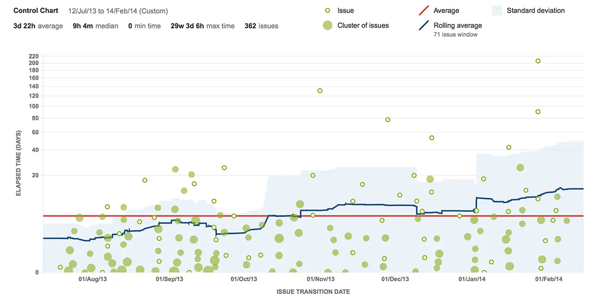
But wait, doesn't Jira already have charts for this? Not really. Jira does have some built-in charts, like Control Chart, but they're kind of like using a plastic spoon to eat a steak – they'll get the job done, but not very efficiently.
Here’s the lowdown on what you might find frustrating:
- Limited Customization: The control chart lets you tweak a few things, but if you’re looking for deep customization to fit your unique workflow, you might feel a bit boxed in.
- Fixed Date Ranges: You’re stuck with preset timeframes. If you want to analyze a specific period that doesn’t align with those options, good luck!
- Lack of Advanced Filtering: While Quick Filters are available, they don’t cut it for teams that need more granular data selection.
- No Multi-Board Comparison: Want to compare performance across different teams or projects? Too bad! The control chart only pulls data from one board at a time.
- Absence of Advanced Metrics: The control chart doesn’t give you some of the advanced cycle time metrics that can really help you dig into the details, like breakdowns by issue type or assignee.
One client summed it up nicely: "The widgets in Jira are static. They're not as helpful as we need them to be. You can't zoom in or out, and filtering by specific statuses is a hassle."
We received a lot of feedback like this until we thought, "Hey, why don’t we create an Atlassian Marketplace app that would finally give teams what they need?"
And this is how we developed the Cycle Time Chart Gadget.
Alternatives: Agile Cycle Time charts vs. Other cycle time charts in Jira
Here's why Broken Build's Cycle Time Chart stands out:
- Jira Dashboard Gadget: Seamless integration with your existing setup.
- Comprehensive Features: From Cycle Time Histogram to advanced statistics, it's all there.
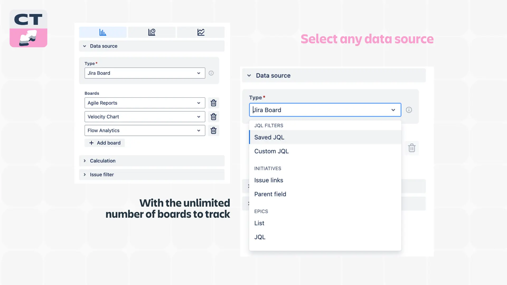
- Multiple Data Sources: Pull data from various teams and SAFe entities.
- Advanced Customization: Filter by any issue type and custom statuses.
- It’s Interactive: The chart changes as you configure the settings.
The swiss army knife of cycle time tracking
Now, let's review what makes the Cycle Time Chart Gadget the ultimate tool in your Agile toolkit.
Jira Time in Status report: bottlenecks Revealed
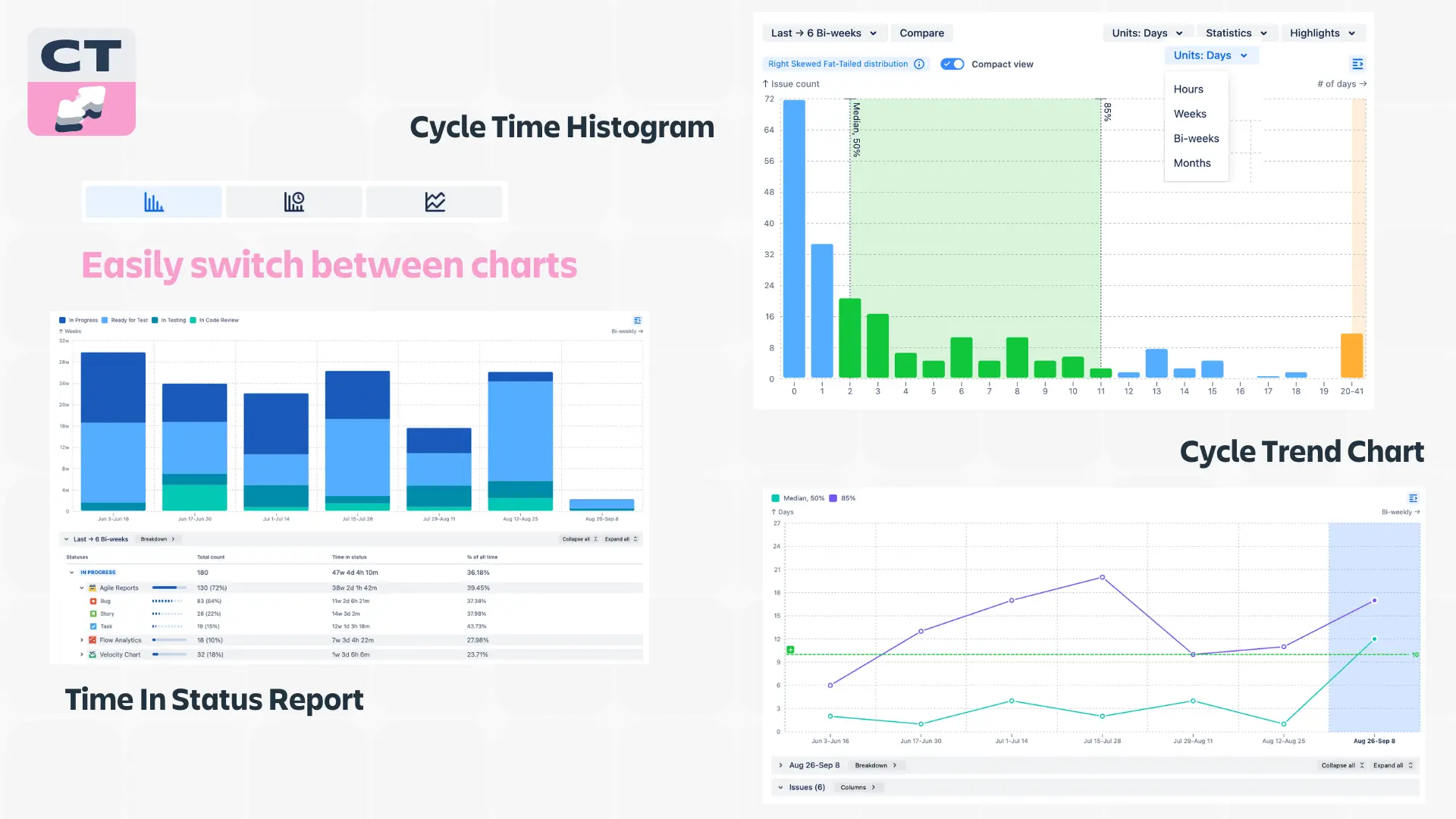
Let's start with the Jira Time in Status report, which breaks down exactly how long tasks are spending in each status of your workflow. It's like having x-ray vision in your process.
Imagine you're making a burger (I really should stop writing hungry). The Jira Time in Status report would tell you how long you spent choosing ingredients, spreading mayo, cooking meats and slicing cheeses, and so on. In your Agile workflow, it might show you how long tasks are sitting in "In Progress," "Code Review," or "Testing."
This way, you can spot bottlenecks fast. For example, when you see tasks spending way too long in "Code Review," you know exactly where to focus your optimization efforts.
Cycle Time Histogram: forecasting simplified
Next, we've got the cycle time histogram. This is like your team's best lap statistics - you can rely on statistical methods to understand the lap time that is most likely to happen and build your forecasts based on that data.
Cycle Time Trend chart: the performance tracker
The Cycle Time Trend Chart shows how your cycle times change over time, so you get:
- Long-term view: It gives you a bird's-eye view of your team's performance.
- Impact assessment: When you implement a new process or tool, the Cycle Time Trend Chart will show you if it's actually making a difference.
- Repeating patterns: Sometimes, your cycle times might fluctuate due to predictable factors like big releases or quarterly rushes. This chart helps you spot these patterns so you can plan accordingly.
Multiple data sources: the big picture
Adding multiple data sources to a chart is like giving you a drone to fly over your entire Agile landscape. It lets you pull in data from various boards or SAFe entities (like initiatives, program increments, etc.), giving you a comprehensive view of your projects.
For example, you might discover that Team A is consistently faster than Team B, and facilitate some knowledge sharing between them.
Cycle Time breakdown: the detective tool
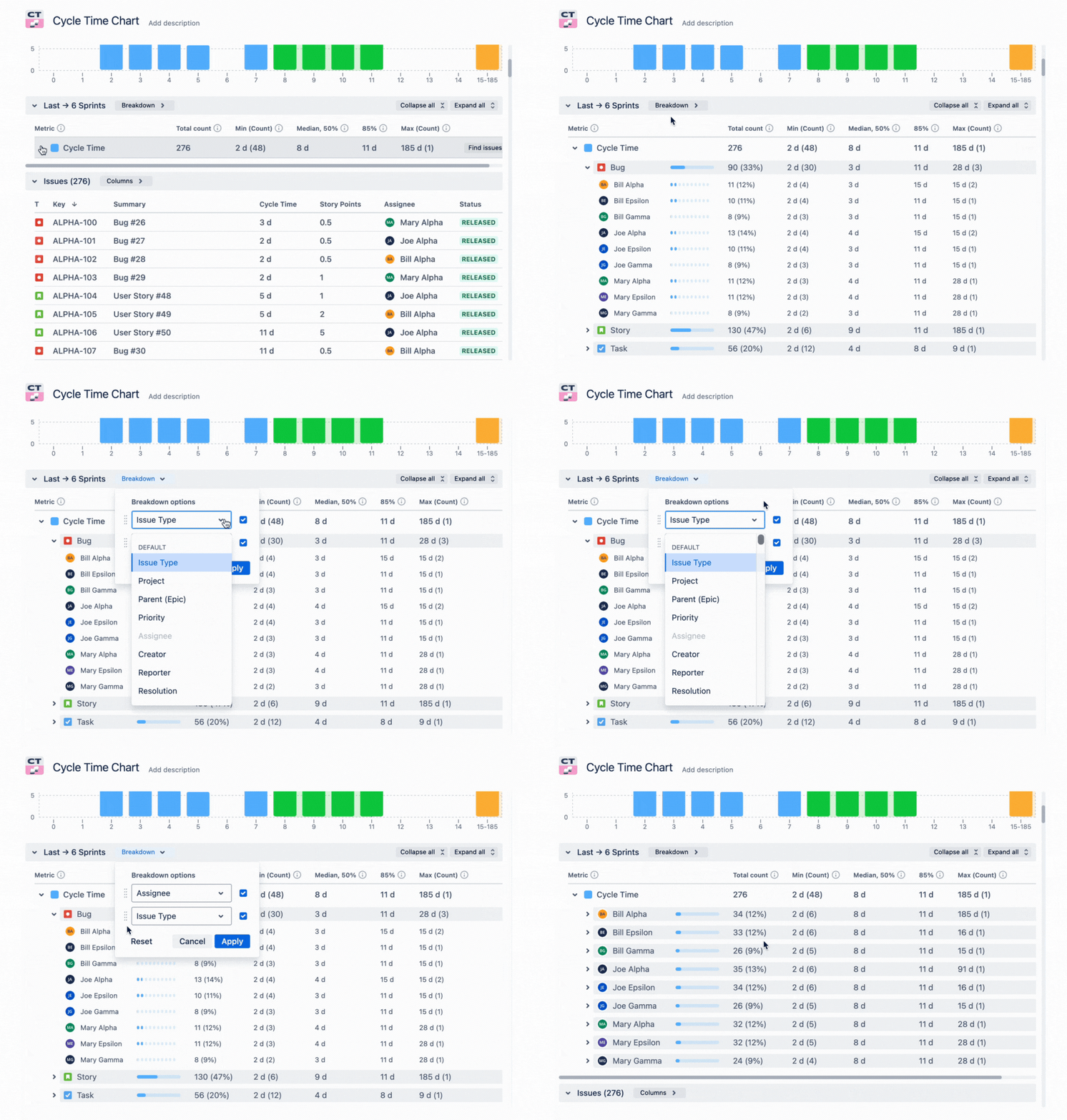
Cycle Time Breakdown lets you slice and dice your data based on any parameter you want. Curious about how cycle times differ between bugs and tasks? Or how do teams compare in their cycle time? This feature has got you covered.
Getting back to our burger-making reference, data breakdown allows you to see how different ingredients impact the cooking time to speed up the whole process.
Cycle Time Chart Gadget has 2 levels of breakdown, which you can layer as you want. For example, you can filter by issue type (breakdown #1) and by assignee (breakdown #2), or vice versa, to see how each team member contributes to cycle time. We’ve put together a list of pre-defined breakdown parameters, letting you use every field in your issue layouts.
Distribution type analysis: cycle time cheat-sheet
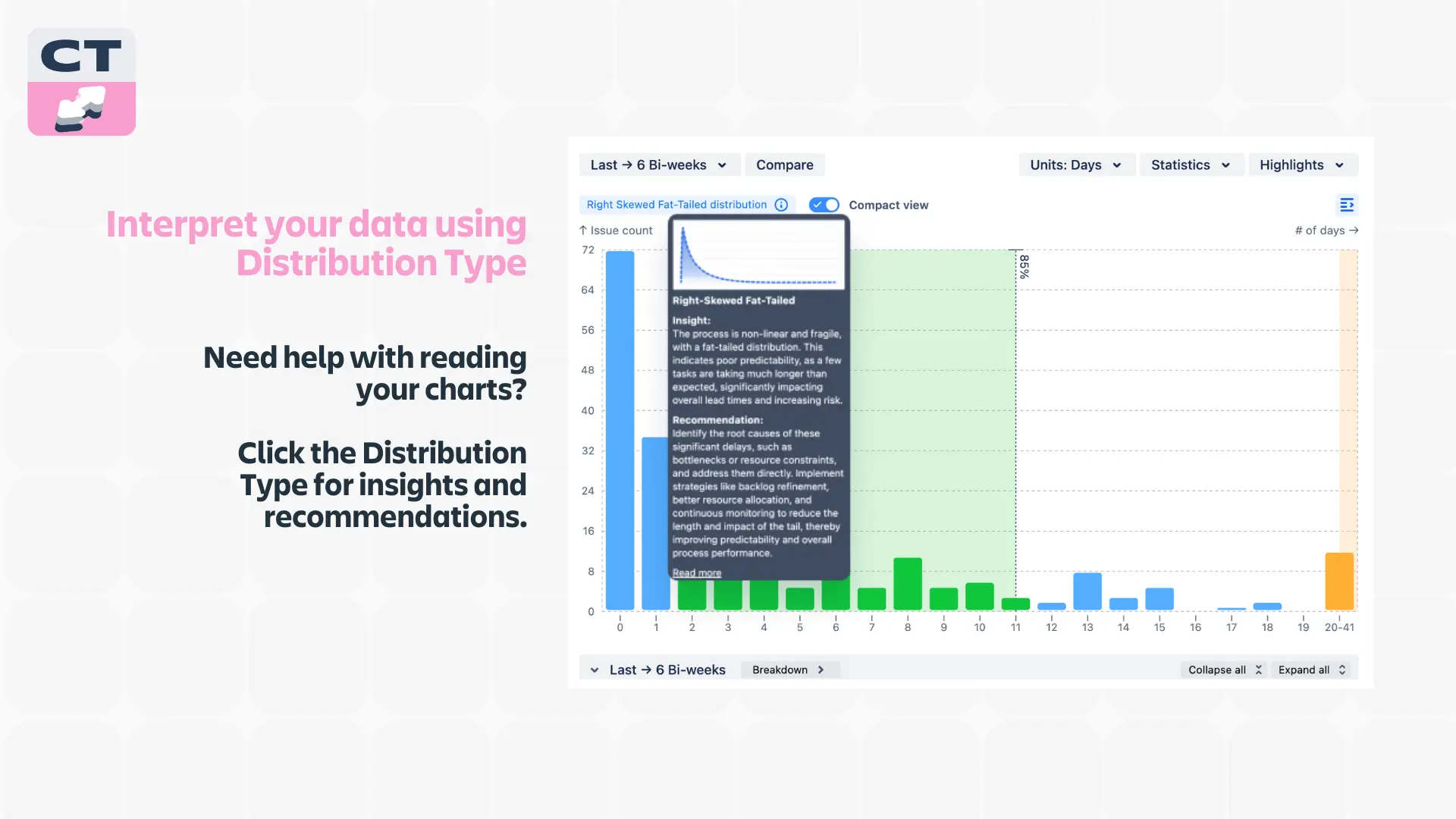
This feature is for all you data nerds out there (and we mean that in the best possible way). It automatically identifies whether your cycle time distribution type is left—or right-skewed, with a thin—or fat-tailed distribution, and gives you recommendations accordingly.
Granular work schedule: targeting with precision
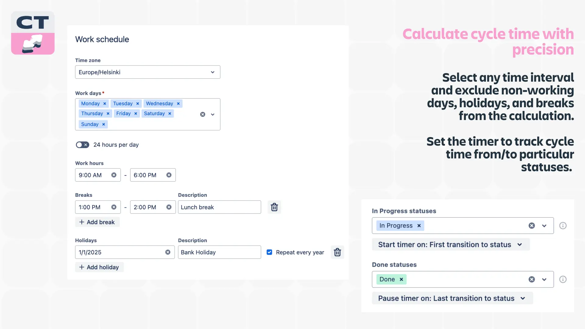
The Granular Work Schedule allows you to define your team's work schedule by including working days and hours and even accounting for holidays or team-specific time off.
This ensures your cycle time calculations are based on actual working time, not just calendar days. It's the difference between saying, "This issue took 5 days" and "This issue took 40 working hours spread over 5 days with a public holiday in the middle."
Issue list: the Microscope
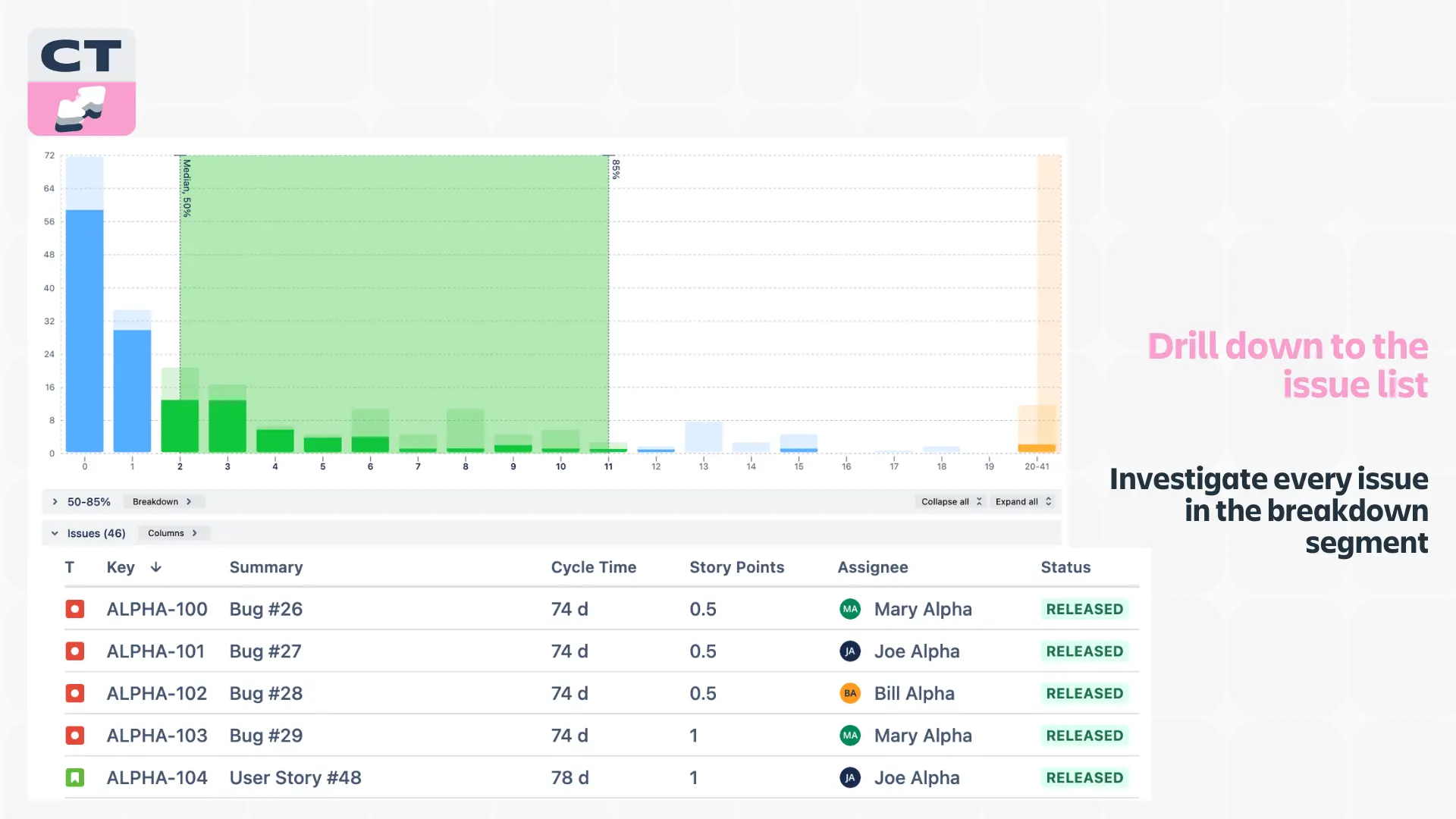
The Issue List feature breaks down cycle time into a list of individual issues, letting you see the cycle time for each specific issue in Jira.
This way, you can investigate issues in a specific breakdown segment. Maybe you'll spot a pattern – like all tasks related to a particular feature taking longer than expected.
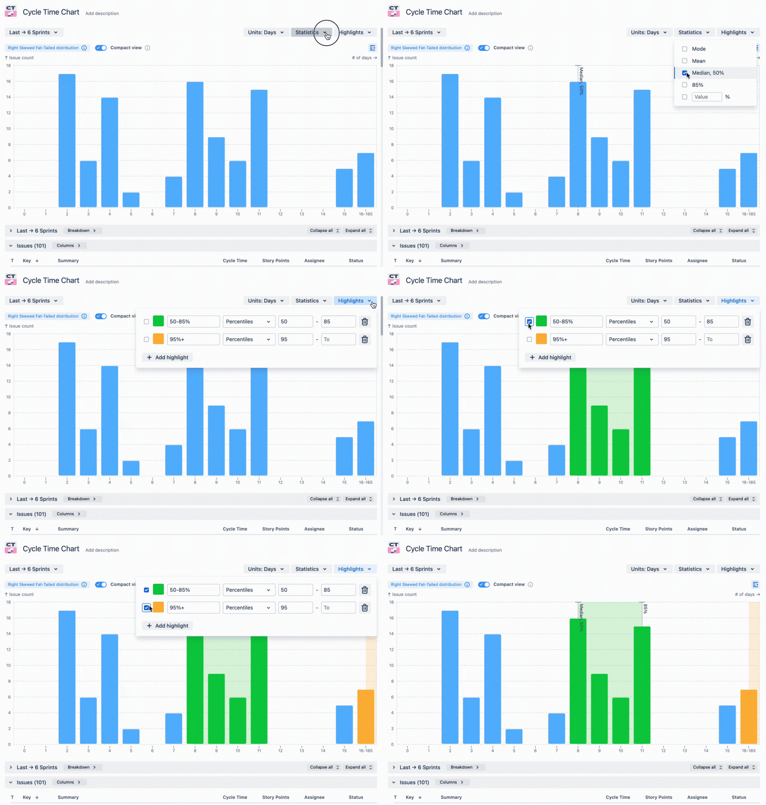
Highlights, Thresholds, and Targets: the traffic light system
These features are the traffic light system for your cycle time. They provide visual cues that make it easy to see when cycle times exceed thresholds or meet targets.
It's a quick and easy way to gauge performance at a glance.
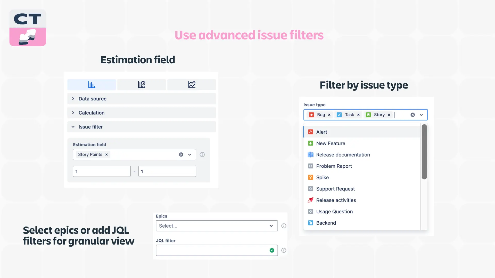
Estimation filter: the red pill from Morpheus
The Estimation Field allows you to compare estimation units (like story points) with actual cycle time, so you can refine your planning process and make better estimations.
It's like comparing how long you thought it would take to make a burger with how long it actually took (it’s the last burger reference, I promise).
Filter by any issue type: the power of customization
Whether you want to focus on bugs, stories, epics, initiatives, or other business entities, this filter lets you tailor your analysis to specific areas of interest.
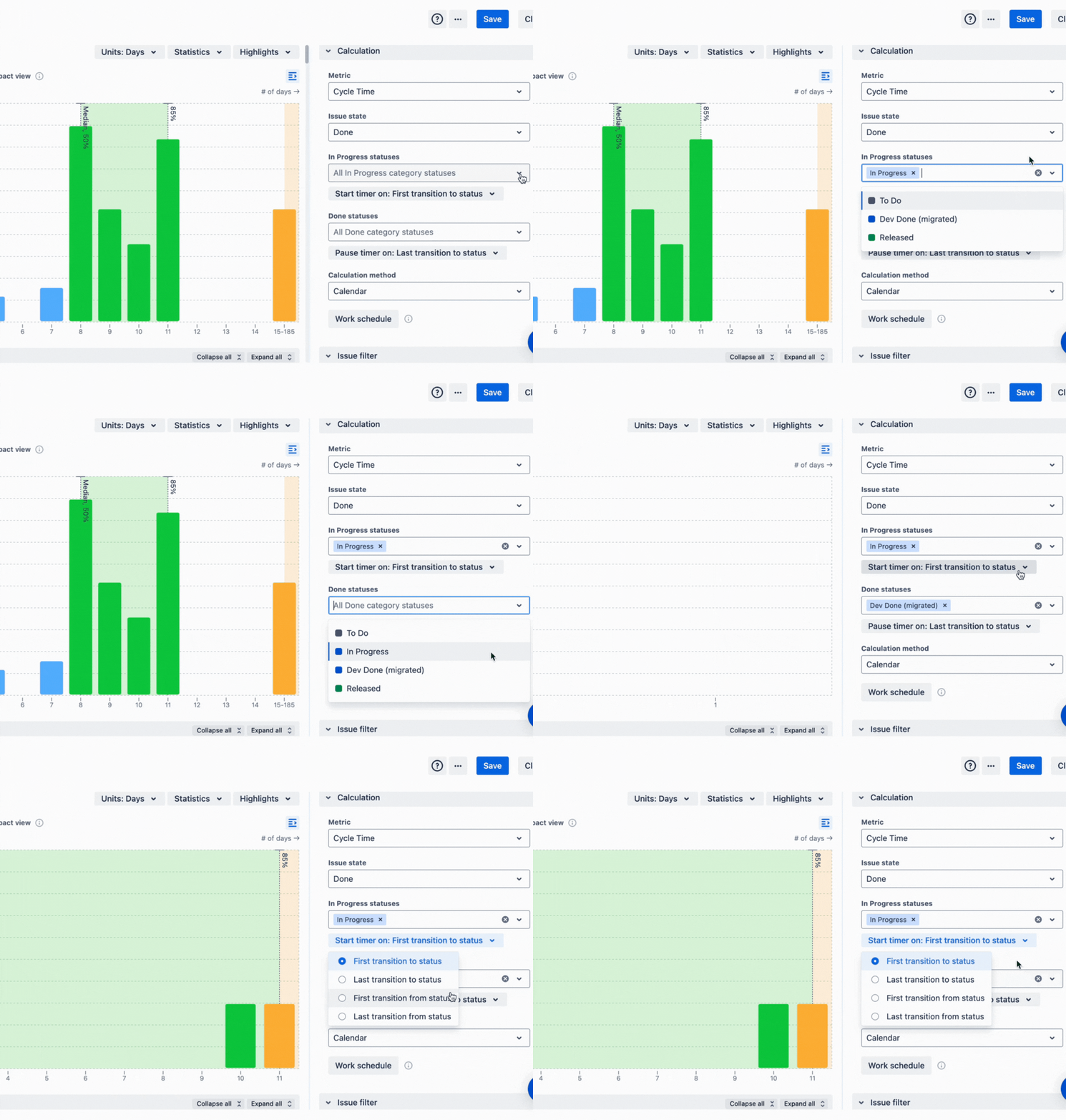
Cycle time tracker: the stopwatch
Last but not least, the Agile Cycle Time Chart has a Timer for precise time tracking, helping you understand exactly where time is being spent in your workflow.
Use it as a stopwatch for each stage of your process to get accurate data to work with.
Why the Cycle Time Charts should be on your Jira dashboard
So there you have it – a deep dive into the Cycle Time Chart Gadget and how it can revolutionize your Agile workflow. This isn't just another tool to add to your already overflowing toolbox. It's more like upgrading from a rusty old hammer to a state-of-the-art power tool.
The UI is intuitive and interactive. Once you change the settings, you see the impact instantly. And the Agile Cycle Time Chart is conveniently placed next to your favorite gadgets on the Jira dashboard.
With features like the Jira Time in Status report and the Cycle Time Histogram, you're getting unprecedented visibility into your team's performance. You're not just guessing at where the bottlenecks are—you're seeing them clear as day, backed up by hard data.
Remember, in the world of Agile development, speed and efficiency are king. The Cycle Time Chart Gadget is your secret weapon for achieving both.
Now, go forth and conquer those cycle times with a 30-day free trial!
And maybe treat yourself to a burger to celebrate. I definitely will!


.png)


.png)

