
What is the difference between calculating velocity in Scrum and Kanban?
Scrum teams measure velocity in story points per sprint. Kanban teams track throughput, measuring completed items over time.
Both approaches need solid metrics for planning and improvement, so let’s look at what comes in the box with Jira. For Scrum teams, you get a basic velocity chart that shows promised versus delivered work. You can track velocity for 1 team and up to 7 sprints, but that's about it. You won’t put that velocity chart on your dashboard, just as you will never be able to compare teams or track individual performance with native Jira charts.
Kanban teams have it even worse. Jira’s Kanban boards come with some valuable metrics, but unfortunately, they're more focused on flow:
- Cumulative Flow Diagrams: A visual tool that helps teams track metrics and understand the progress of work items through various states. It is crucial for identifying bottlenecks and enhancing throughput by analyzing the flow of work.
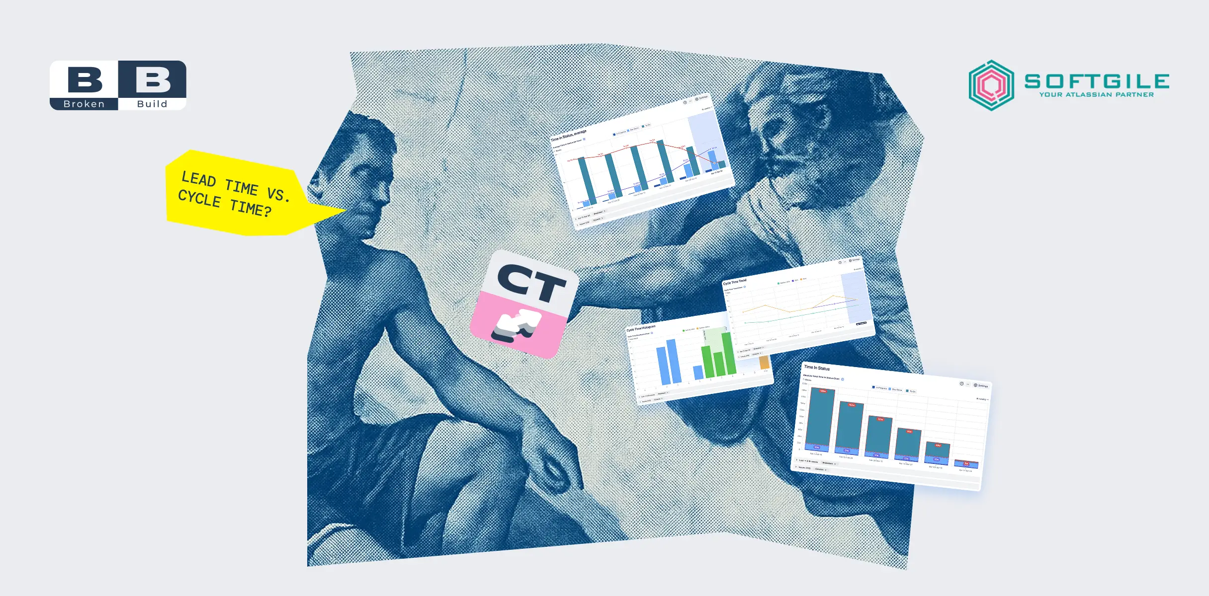
- Cycle and Lead Time Reports: Lead time is the average time required for a task to complete from start to finish. This metric helps teams gauge their efficiency, identify opportunities for improvement, and calculate variations based on specific contextual factors such as order delivery and reordering delays.
- Control Chart
Not having built-in velocity tracking in Kanban boards means
🚫 no automatic velocity calculations
🚫 no sprint-style velocity charts
🚫 very limited throughput visualization.
This is why most teams end up either maintaining separate tracking systems, switching to Scrum boards just for the metrics, or looking for better solutions (mainly at the Atlassian Marketplace).
Speaking of better solutions...
Third-party velocity charts in Jira
Let's talk about the four charts that can transform your Jira dashboard from a basic metrics display into a performance analysis powerhouse. These charts aren't just prettier versions of what you already have - they're entirely new ways of understanding how your teams deliver work.
And sorry to break it to you, but these charts are NOT built-in Jira charts. Yet, they’re easy to use, affordable, and offer a 30-day free trial.
Also, all these charts are conveniently rolled into a single app - the Agile Velocity Chart Gadget by Broken Build. The Agile Velocity Chart Gadget is compatible with both Jira Cloud and Data Center platforms, so it's important to select the correct Jira instance to ensure compatibility with the Agile Velocity Chart Gadget.
Before we begin, let’s briefly list the important features that make all Broken Build apps so powerful.
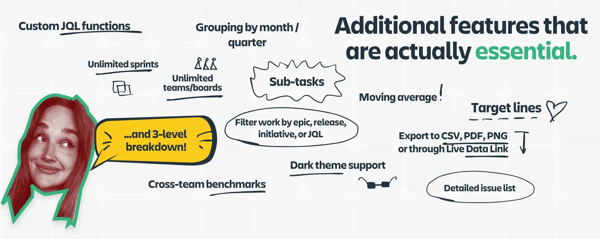
- You can add unlimited Scrum or Kanban boards as a data source.
- Pull data from unlimited sprints.
- Filter data by initiative, epic, release, or custom JQL.
- Break down sprint metrics by priority, issue type, release, assignee, and more.
- Use 3-level breakdowns and drill down to the issue list to inspect each metric in detail.
- Define patterns, trends, and anomalies with target lines and moving averages.
- Analyze the entire sprint history with detailed, single-click sprint reports.
- Share velocity charts as reports, gadgets, PNG/PDF, and CSV, or through the Live Data Link.
Now, it’s time to look at the velocity charts more closely.
360-degree velocity analytics in Jira
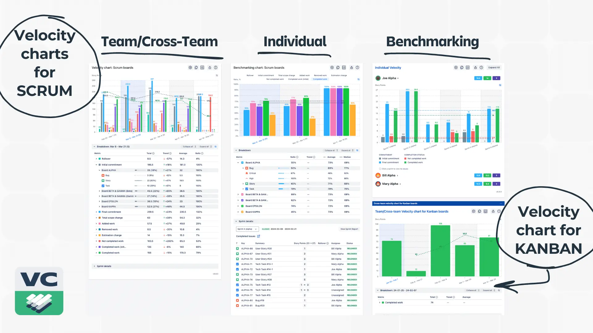
1. Velocity Chart for Teams and Cross-Teams
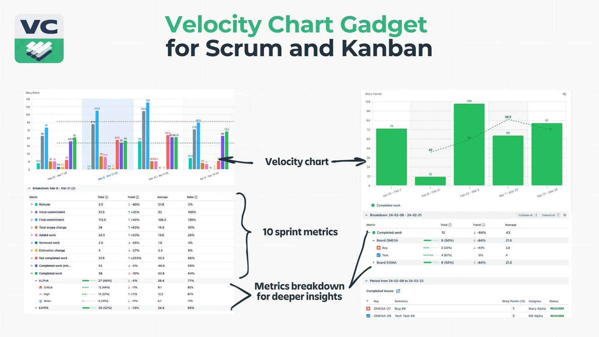
While Jira's native tool gives you basic commitment versus completion metrics, the Agile Velocity Chart Gadget breaks down velocity into ten crucial metrics that tell the complete story of your sprint.
Think about your last sprint review. You probably talked about what got done and what didn't. But what about the scope changes that happened along the way? The estimations that turned out to be way off? The work that got added or removed mid-sprint? These metrics matter, and now you can track them all.
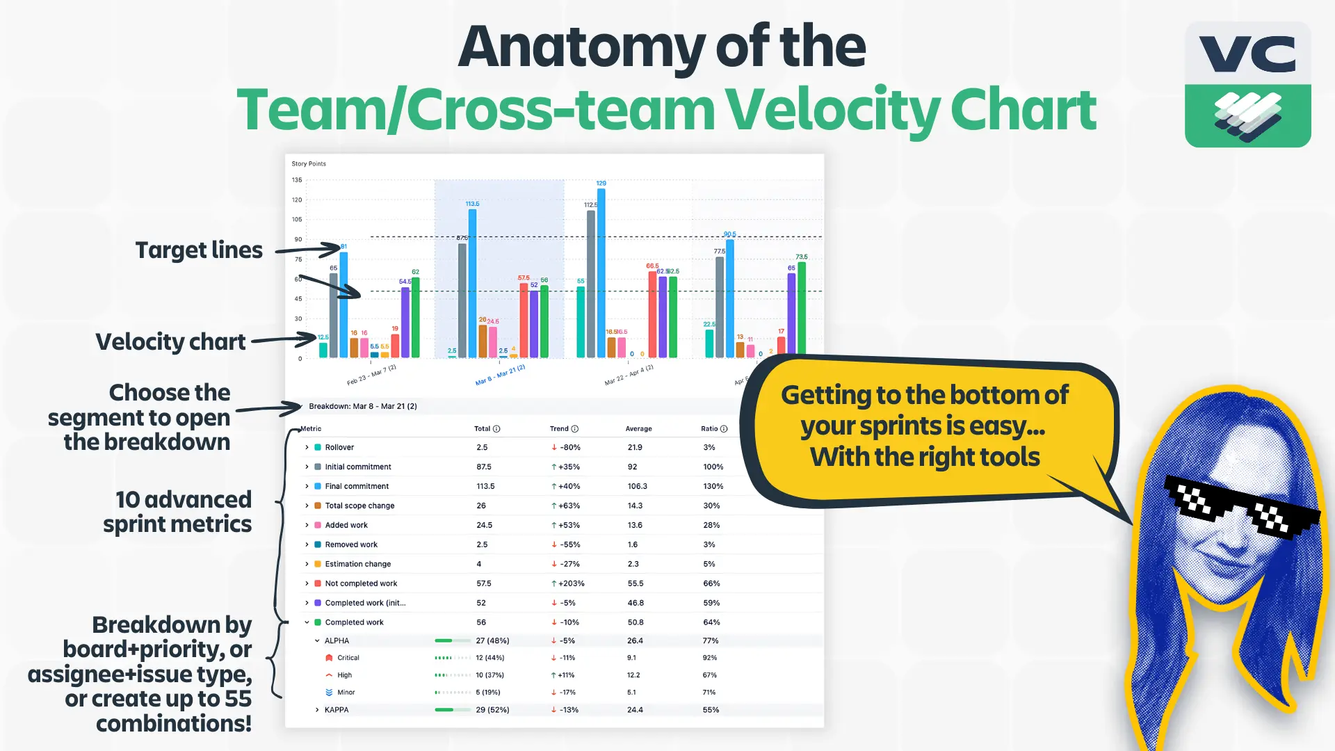
We have an entire blog post about slicing and dicing your sprints with advanced sprint metrics + breakdowns combo, so let's briefly explain why they matter one more time:
You’re familiar with the Initial Commitment - it shows where you started, and it’s your team's first bet on what they could deliver.
Final Commitment reveals how that initial plan evolved. The difference between initial and final commitment tells you a lot about your planning process and how well you understand your work.
The difference between these numbers often tells a more interesting story than the numbers themselves. When you see a pattern of increasing final commitments, you might have a scope creep problem. Or maybe your team's getting better at handling additional work - context matters.
Rollover work isn't just about missed targets. It's about understanding why work carries over and what that means for your team's planning. Are you consistently rolling over certain types of tasks? That's valuable information for your next sprint planning session.
Total Scope Change gives you the big picture of sprint volatility. You can break this down further to see exactly how your scope changed with a range of scope change metrics:
Added work
Removed work
Estimation change
Each tells a different story about your sprint dynamics.
The Completed Work metric sums up everything your team managed to finish during the sprint. But to bring even more clarity, we added a couple more metrics, such as Completed Work (Initial), that measures the work that was completed as initially planned, offering a clear view of how effective your sprint planning was and how well the team stuck to the plan.
And Not Completed Work because not all work makes it to the finish line during the sprint. With this metric, you can understand whether it’s a matter of unrealistic planning, shifting priorities, or perhaps something else.
And speaking of breakdowns, this is where the velocity charts really shine. Every one of these metrics can be broken down twice more by team, component, priority, or any custom field you've set up. Want to know how scope changes affect different teams? Or how does estimation accuracy vary by priority?
Now you can.

2. The Individual Velocity Chart
"But wait," you might say, "isn't individual velocity tracking a micromanagement tool?" Not if you use it right. Our “How to use individual velocity to everyone’s benefit“ article covers how to do it.
This chart isn't about comparing developers or creating competition. It's about understanding patterns and supporting your team effectively.
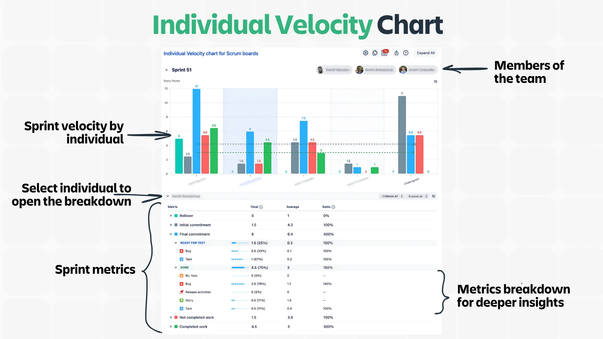
Think about these scenarios:
- Your best developer is consistently delivering less than usual - maybe they're stuck with unfamiliar work and need support
- A new team member's velocity is rapidly increasing - a perfect time to give them more challenging tasks
- Someone's consistently handling high-priority items quickly - they might be great at breaking down complex work
The key is using this data to help your team grow, not to create pressure or unhealthy competition.
3. The Benchmarking Chart
Forget about comparing raw velocity numbers between teams - this chart gives you meaningful benchmarks across multiple teams.
Think about it: Team A delivering 40 points and Team B delivering 20 doesn't tell you much. But seeing how each team performs against established benchmarks? That's useful data. Tracking team velocity can help in setting realistic benchmarks. These benchmarks can also enhance the team's ability to track performance and improve workflow predictability.
The benchmarking chart shows you:
- Average performance across teams
- 75th percentile of high-performing teams
- Median to understand typical delivery patterns
- 25th percentile to identify teams that might need support
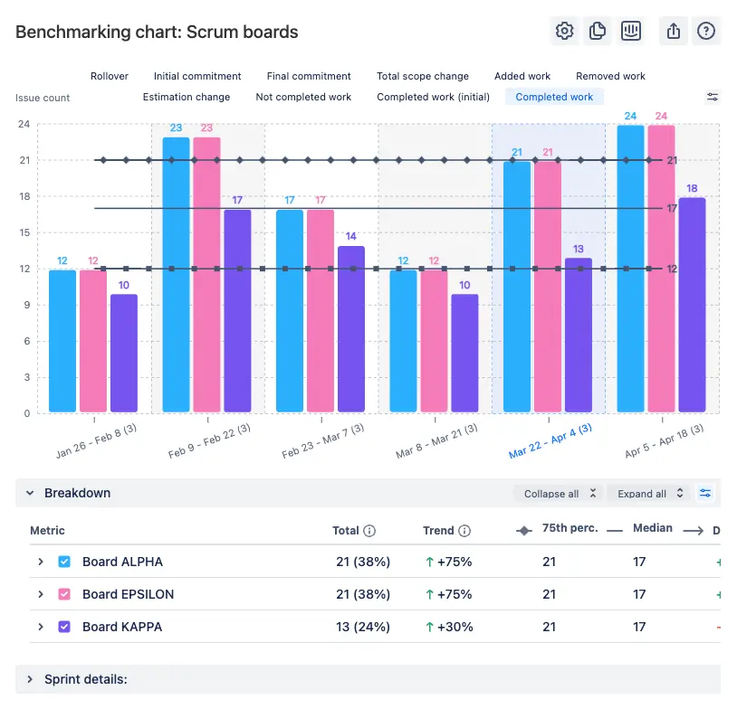
The key is using these benchmarks constructively. If a team falls below the 25th percentile, open the breakdown - it's your opportunity to understand what challenges they're facing and how to help.
4. The Kanban Velocity Chart
Finally, something for Kanban teams that doesn't involve manual tracking or complicated workarounds. This chart takes everything great about velocity tracking and adapts it for continuous flow. No more switching to Scrum boards just to get decent metrics. The Kanban Velocity Chart enhances the functionalities of a kanban board for better performance monitoring. It also helps in visualizing and optimizing the process flow within Kanban systems.
Here's what makes this different from your standard Kanban metrics: you get the same powerful breakdown capabilities as Scrum teams, but applied to throughput over any time period you choose. Want to see how many story points your support team handles monthly? Done. Need to track throughput by priority across quarters? Easy. And on top of that, you can use custom estimation fields.
So, if story points don't make sense for your workflow, create your own system. The chart doesn't care - it'll track whatever numbers matter to you.
Adding velocity charts to the Jira dashboard
Setting up the Agile Velocity Chart is very simple for Kanban and Scrum users:
- Set up your Jira account.
- Get a free 30-day trial of the Agile Velocity Chart Gadget.
- Add the Agile Velocity Chart to your dashboard (choose between Individual, Team/Cross-Team, Benchmarking charts for Scrum or the Velocity Chart for Kanban - or take them all for a 360-degree view).
- Add a board or multiple boards as a data source.
- Choose sprints or a period of time you want to analyze.
- Add target lines to visualize progress.
- Choose breakdown parameters and their levels.
- Watch the insights roll in!

Bottom line
These aren't just prettier versions of Jira's native charts. They're tools for understanding how your teams actually work and making better decisions about how to improve.
Use them to:
- Make data-driven decisions without drowning in spreadsheets
- Understand team patterns
- Plan realistically
- Improve continuously without burning out
Don't use them to:
- Create unhealthy competition
- Set arbitrary targets
- Micromanage your teams
- Make people feel like numbers
Remember: The goal isn't perfect metrics - it's better delivery. These tools help you understand how to get there.
FAQ
How many sprints do I need to analyze velocity?
Jira native velocity chart is limited to 7 sprints - unlike the Agile Velocity Chart Gadget. Use as much historical data as you have. More data means better trend analysis and more accurate forecasting. Just remember that ancient history might not reflect your current team's capabilities.
Can I track multiple boards in one velocity chart?
With the Agile Velocity Chart - yes. Set up different velocity charts for different boards, or use the cross-team features to compare them. Just remember to configure your JQL filters properly to avoid data overlap.
How do I set up velocity benchmarks across teams?
Start with your 50th percentile (median) as your baseline. Set your target line slightly above your 75th percentile for a stretch goal that's actually achievable. Don't forget to adjust these as your team evolves.
What's the best way to calculate velocity in story points after team changes?
Use the time-based grouping feature to mark team composition changes. You can create markers for before/after significant changes and use custom JQL to filter data accordingly. This helps explain velocity changes to stakeholders.
How should I configure velocity chart breakdowns for a large project?
First level is always one of your sprint metrics. For levels two and three:
- Large teams: Component → Priority
- Multiple teams: Team → Component
- Complex products: Epic → Component
How can I include sub-tasks in the Jira velocity chart?
With a native Jira chart, you can’t. With the Agile Velocity chart gadget, you've got options:
- Roll them up into parent tasks for high-level velocity
- Track them separately for detailed analysis
- Use custom JQL to include/exclude based on your needs
The key is consistency in your approach.
Is there a Kanban velocity chart for a Kanban board in Jira?
No, Jira doesn’t offer velocity charts for Kanban boards by default. However, third-party apps like the Agile Velocity Chart Gadget work both in Scrum and Kanban, offering Kanban teams detailed analytics right on the Jira dashboard. These apps can help track the team's velocity in Kanban, providing insights into the rate of task completion. Additionally, they can track the number of tasks completed to provide detailed analytics on team performance and efficiency.


.png)



.png)

