


In this article
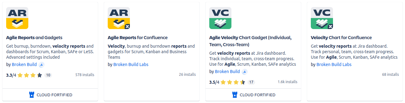
Our two flagship apps, Agile Reports and Gadgets and Velocity Chart Gadget, both got major updates on May 1, 2024, with the goal of making the apps even more useful for teams and providing delivery insights that encourage meaningful discussions.
In this article, we will explore the story behind this release and the ideas gained from discussions with practicing delivery managers, agile coaches, directors, and VPs. All these great ideas have been turned into new user capabilities in this latest release.
Scaled Agile Delivery Analytics
Our focus on the enterprise sector has grown since last year, when we shifted from team-level reporting to cross-team reporting in organizations, as reflected in version 6.0.0 and subsequent versions of the Agile Reports and Gadgets app (ARG).
This expansion does not imply that we have stopped developing team-level features for the Velocity Chart Gadget app (VEL) - we continue working on features that benefit both apps and their Confluence spin-offs.
Connecting with the Enterprise world was critical for our small indie company with only one delivery team in order to understand what was on their mind and heart. And there's still no better way to connect with your users than direct communication. With that in mind, we integrated Intercom Messenger into our apps—yes, you can instantly contact us in any situation. Additionally, we included a button to schedule a demo on the Atlassian Marketplace page and Getting Started pages for each app.
Luckily, the people who used our service—from agency project managers to VPs at big software companies—turned out to be a great source of truth for us. Each demo and feature request was invaluable, like water in a desert. Gotten insights became the cornerstone for developing ARG version 7.0.0 and VEL version 6.0.0.
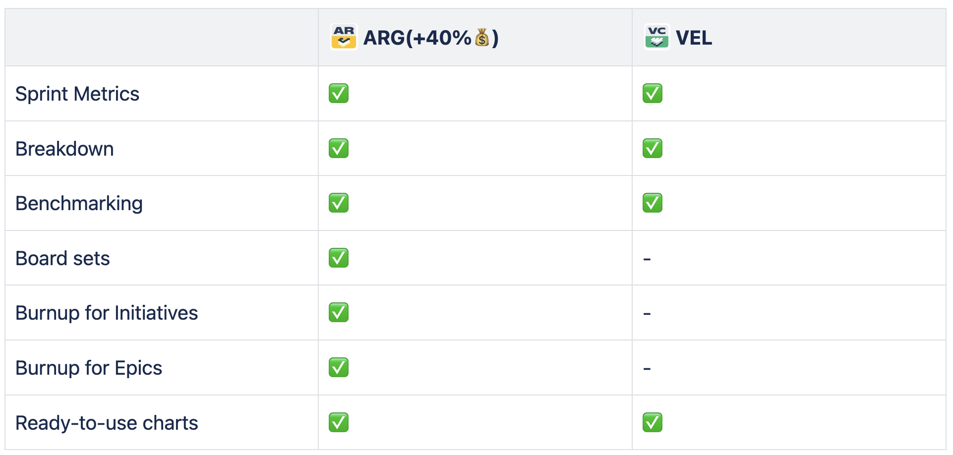
These versions open a new chapter in Scaled Agile Delivery Analytics, titled "Sprint Metrics' Breakdown & Benchmarking."
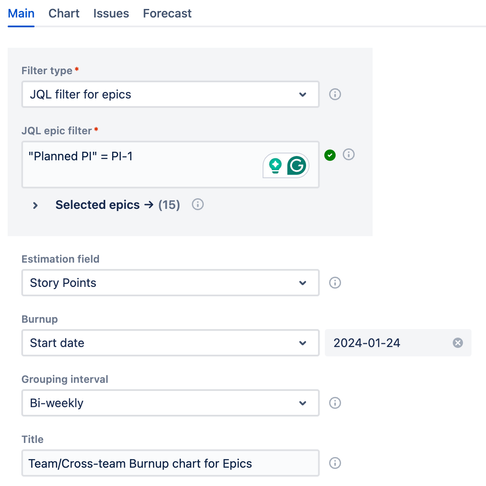
ARG users also have exclusive access to new significant enterprise features such as Board sets, Burnup Chart for Epics, and Burnup Chart for Initiatives.
Sprint Metrics
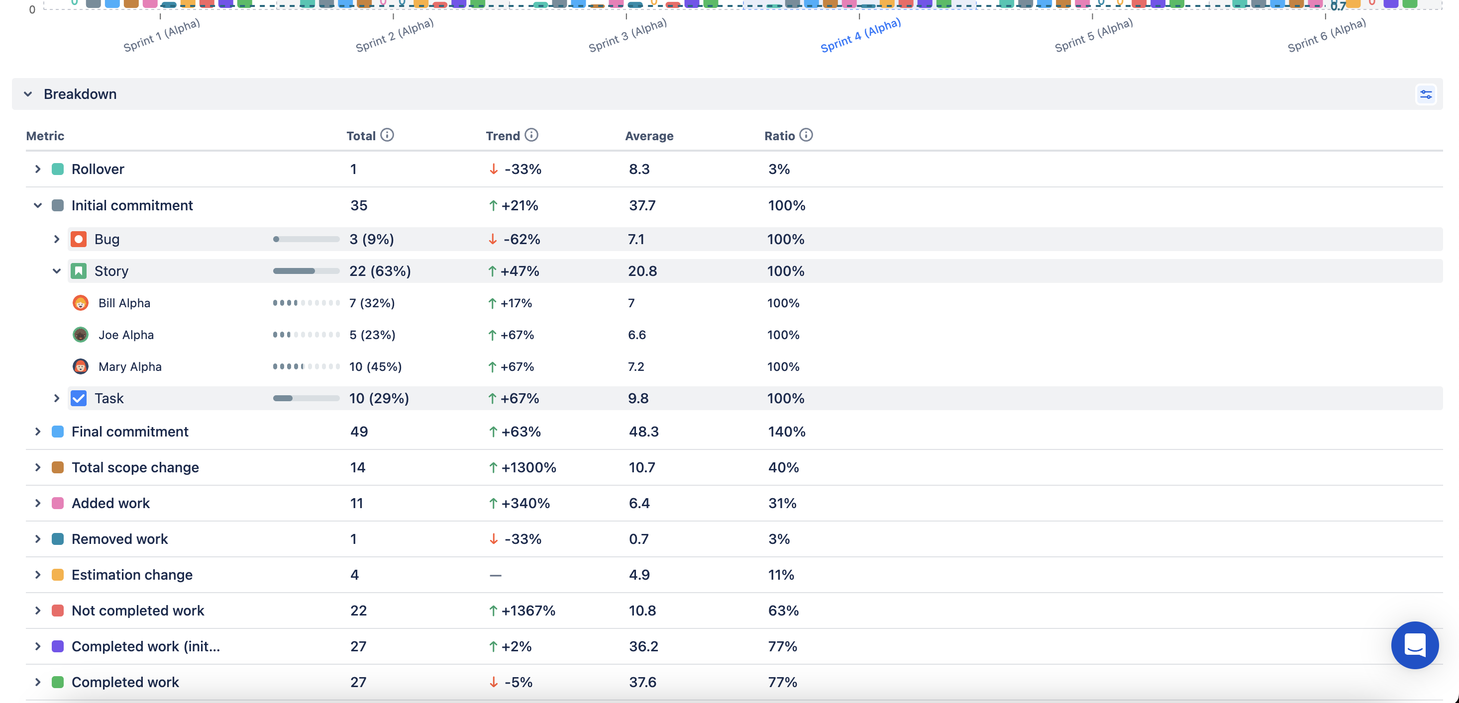
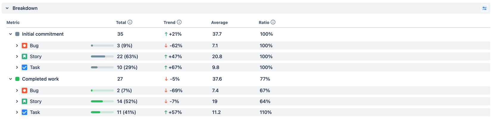
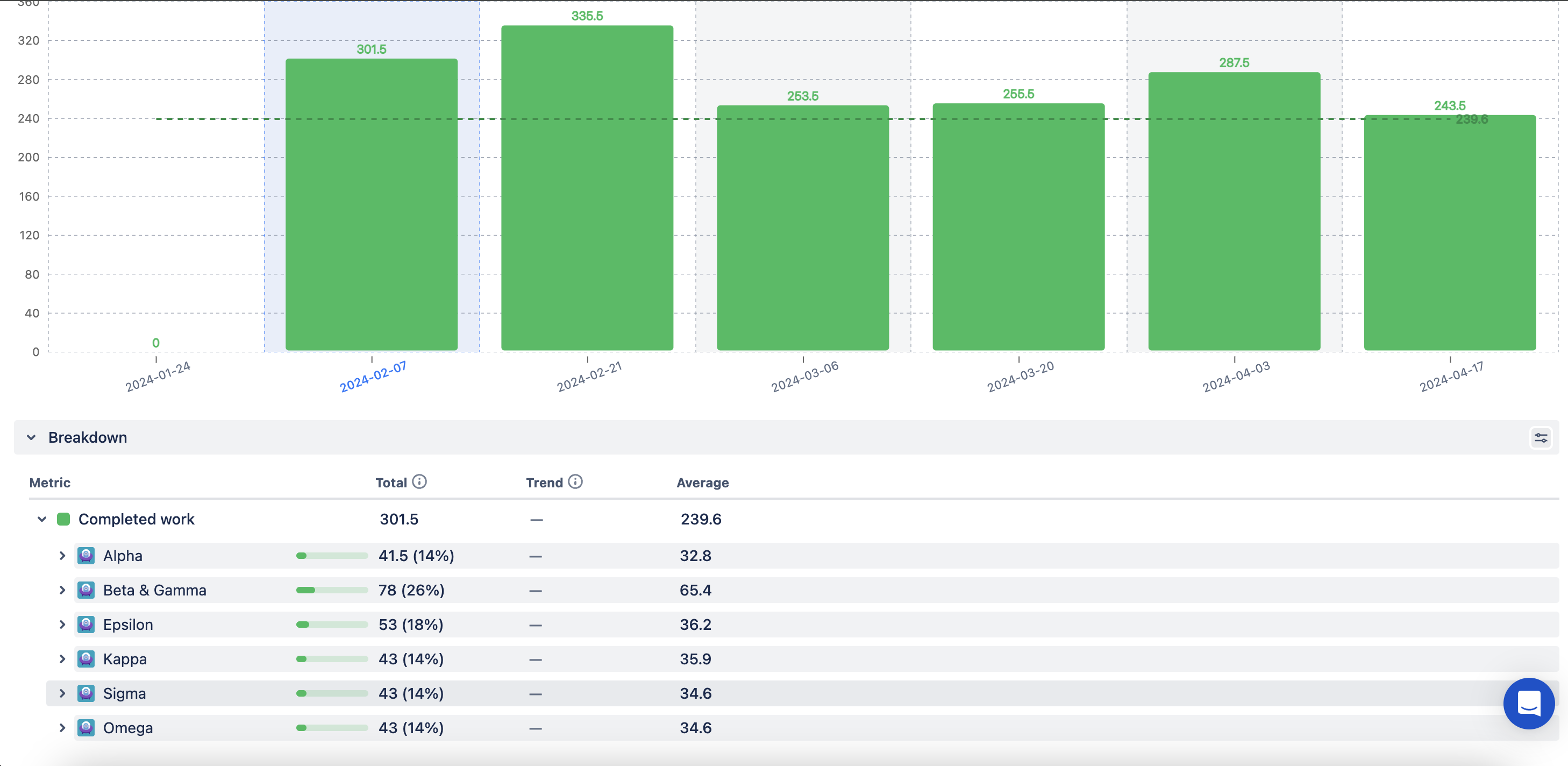
For Scrum teams operating in sprints, having the Commitment and Completed Work metrics is enough to calculate the velocity. However, the velocity number alone does not fully explain the story behind the sprint. You need to know if the team changed their Initial Commitment, by how much, and why—whether due to the work added during the sprint or an estimation error. Knowing how many story points were not completed is critical for evaluating the sprint's success.
Sprint Metrics addresses these questions by showing total data in story points (time units or issue count) or relative to the commitment.
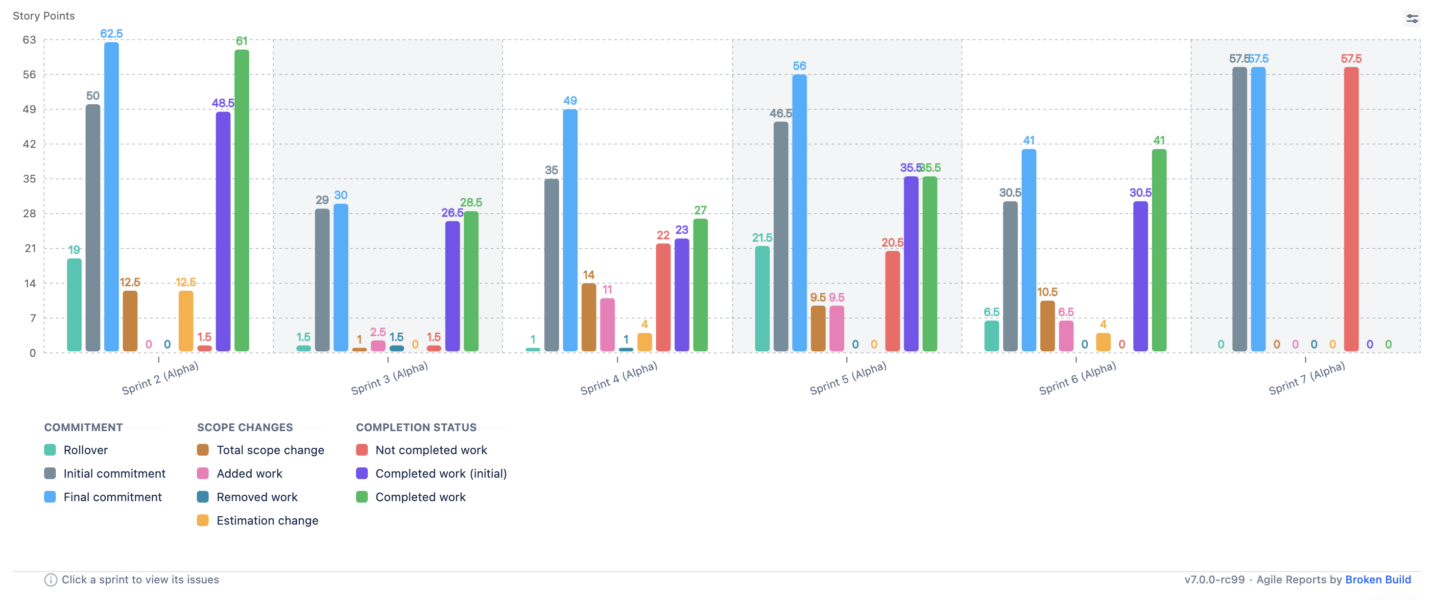
Also, as a part of this new release, we are happy to introduce two new sprint metrics—Rollover and Total Scope change—and provide an update on the Completed work (initial) metric.
Sprint Rollover
When a team starts a sprint, it's common to have some planned issues started in the previous sprint (leftovers) and others that haven’t started yet (spillovers), which are then rolled over to the new sprint. It's typical for some issues to roll over from sprint to sprint, often getting lost in the workload.
To address this, we introduced the sprint Rollover metric. This metric sheds light on several critical aspects:
1. How many story points were rolled over, affecting the team’s actual capacity for new work?
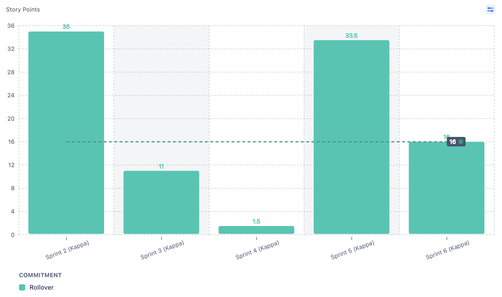
2. How often did a particular issue roll over from one sprint to another?
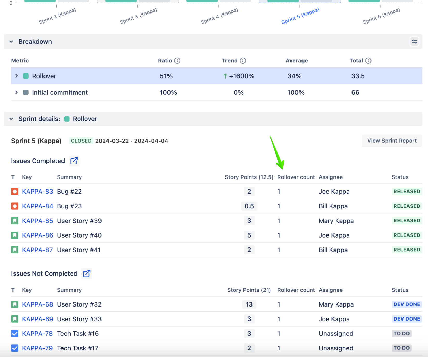
3. What proportion of the Initial Commitment was taken up by Rollover issues across a series of sprints? Is everyone satisfied with this? If not, what should be considered a healthy pattern?
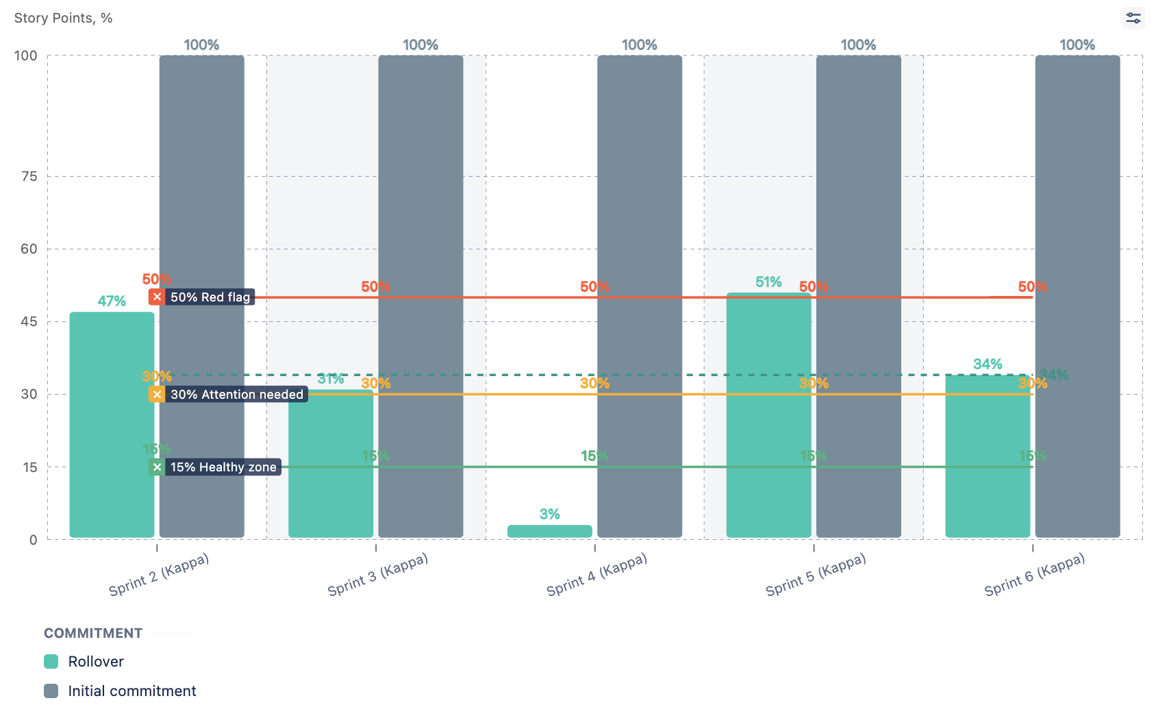
4. Were all incomplete issues transferred to the next sprint? Is everyone content with this?
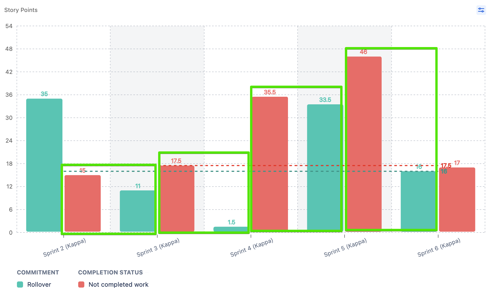
By focusing on these questions, the sprint Rollover metric aims to provide clarity on how ongoing issues affect the project and assist teams in evaluating the effectiveness of their sprint planning.
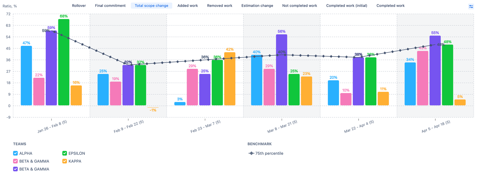
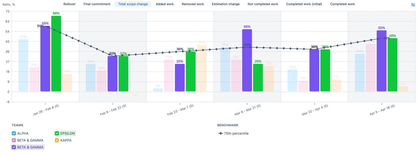
Total Scope Change
The Estimation Change, Added Work, and Removed Work metrics contribute to the difference between the Initial Commitment and Final Commitment, giving a better understanding of why the scope of work changed.
Recognizing this, we felt it was critical to introduce the Total Scope Change metric to address the following questions:
1. By how many story points was the sprint scope affected?
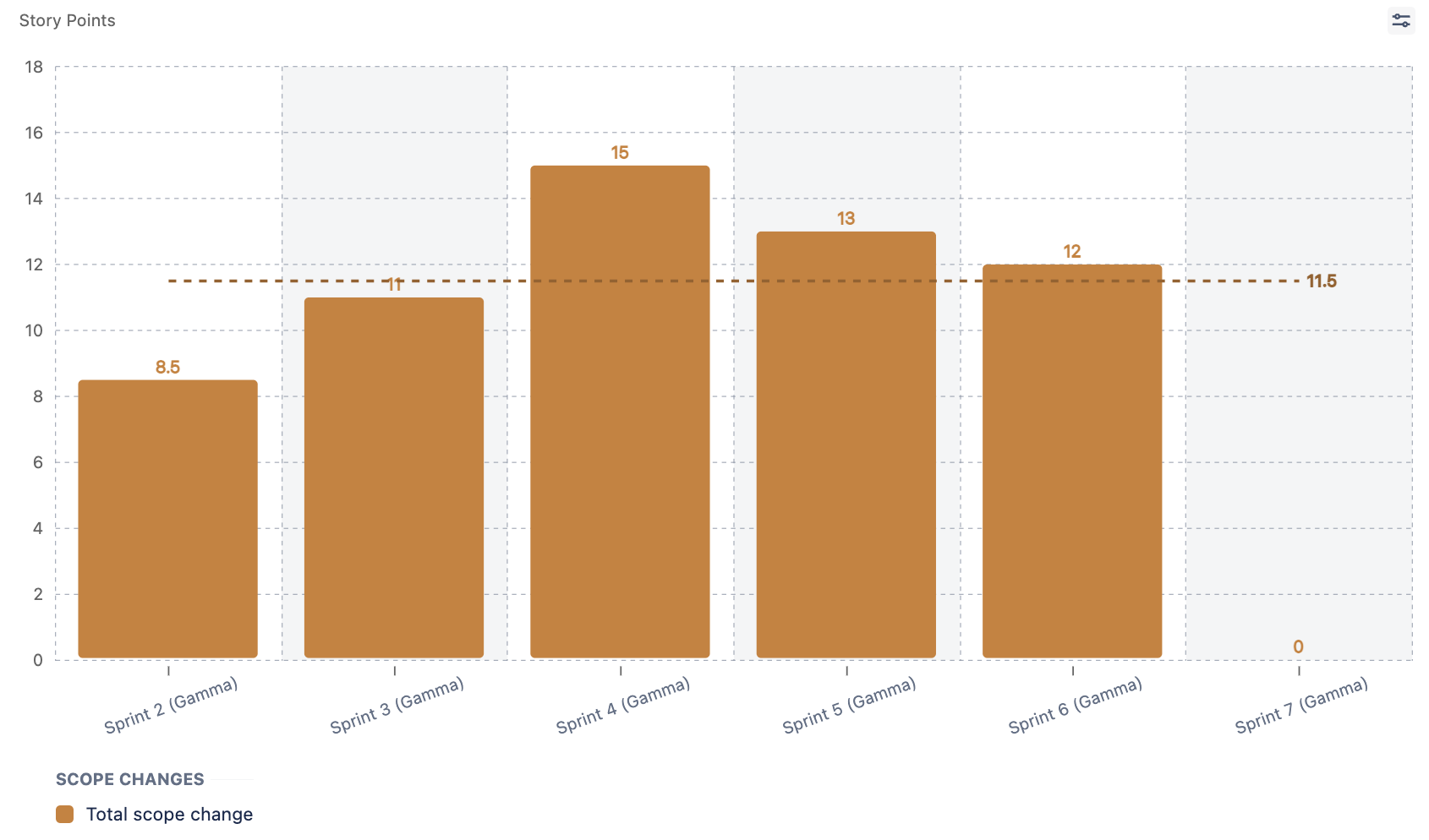
2. Which issues have led to these changes?
3. What proportion of the Final Commitment was altered over a series of sprints? Is this an appropriate degree of change? What should be considered a healthy pattern?
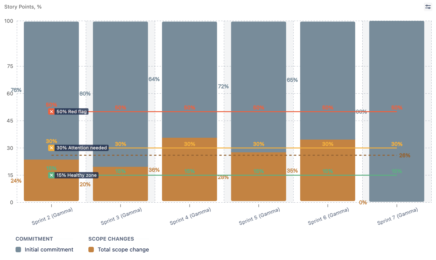
The scope of work metric is intended to provide a comprehensive overview of scope adjustments made during the sprint, allowing teams to better understand and manage changes to their project commitments.
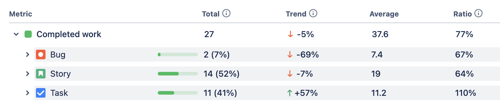
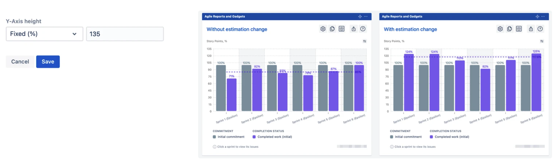
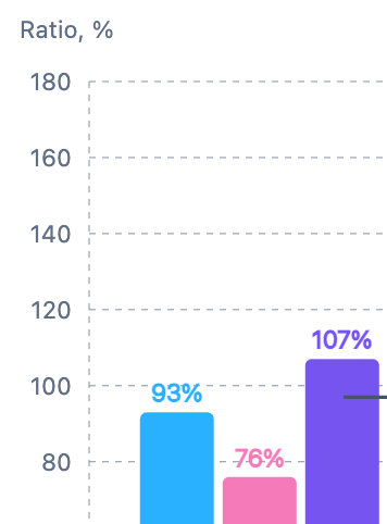
Completed work (initial)
When reviewing the built-in velocity chart in Jira, if both the Initial Commitment and Completed figures are listed as 25 story points, it would imply a Say/Do ratio of 100%. However, it's possible that not all sprint goals were achieved. This could occur if issues were re-estimated or added during the sprint, affecting the final numbers on the chart.
To address this, we introduced the "Completed Work (initial)" metric, which reflects the completion rate of the work initially planned.
Now, this metric works in two ways:
Without applying estimation changes to issues in Initial Commitment: This default mode provides a straightforward view of the percentage of initially planned work completed. It shows the success rate of the sprint goals, assuming that the Initial Commitment accurately represents them.
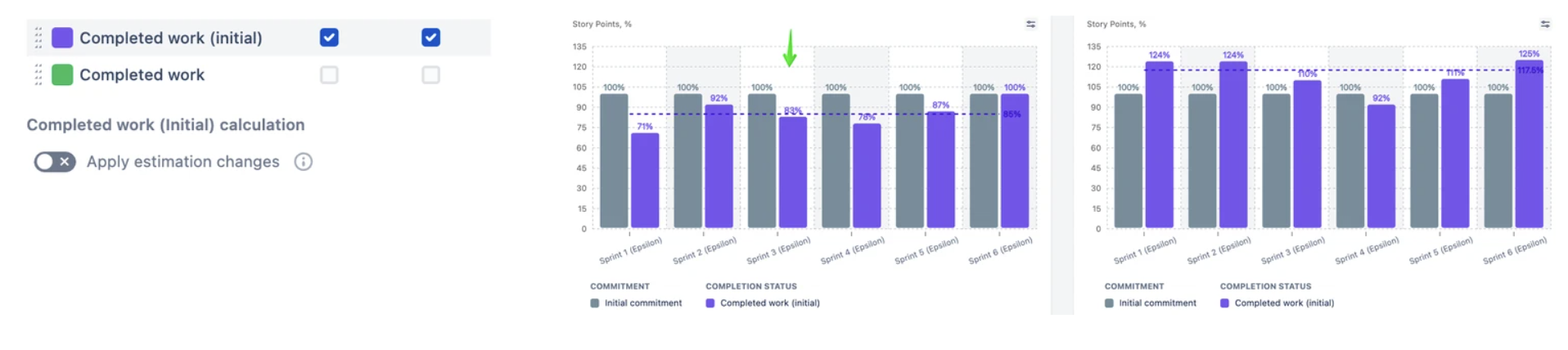
With applying estimation changes to issues in Initial Commitment: This mode adjusts the completion figures to include any changes in estimates during the sprint. It shows how many story points were completed from the initial planned scope, taking into account any changes to the initial estimates.
These modes take into consideration changes in scope and estimating practices that occur during the sprint, which helps to give a more detailed understanding of how much progress was made.
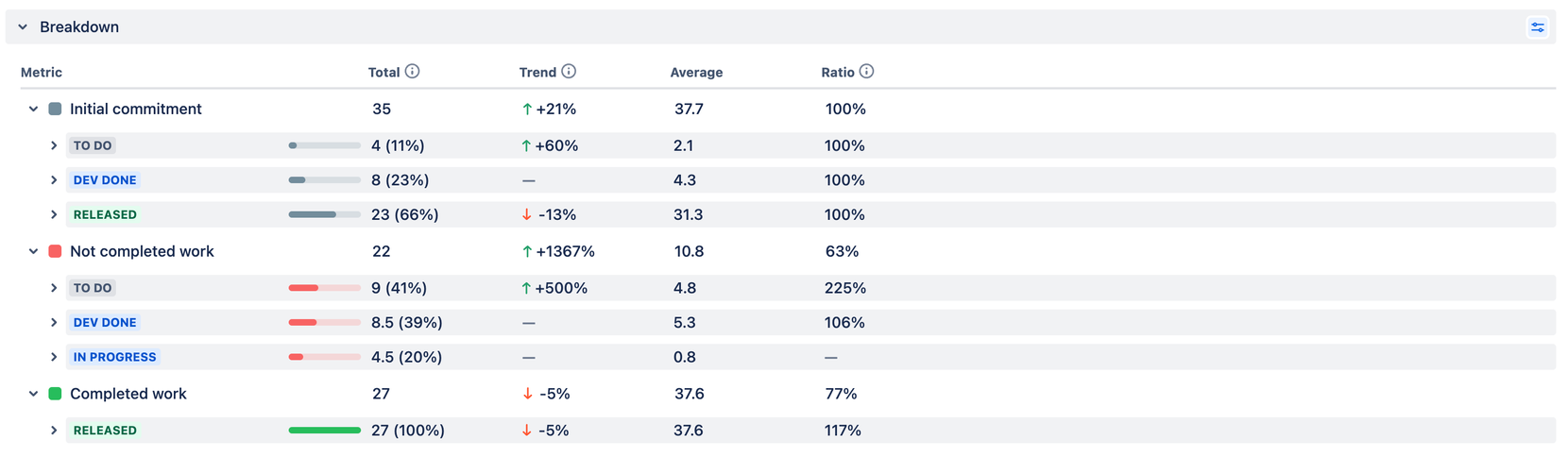
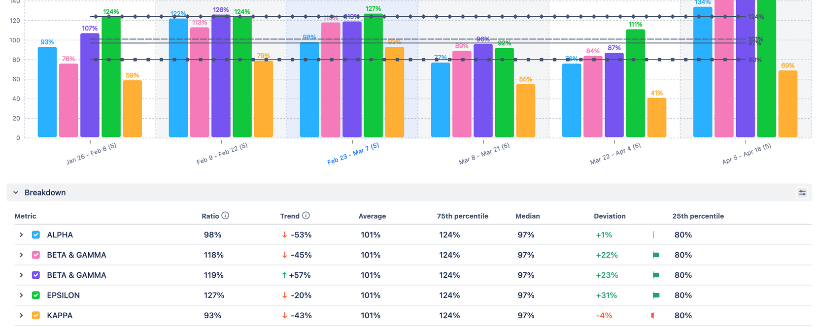
Sprint Breakdown
Every issue in Jira comes with an extensive list of fields that provide additional context to the "work" described in the ticket. This added context stimulates our cognitive processes, enabling us to picture the abstract folders and boxes where all these issues are organized.
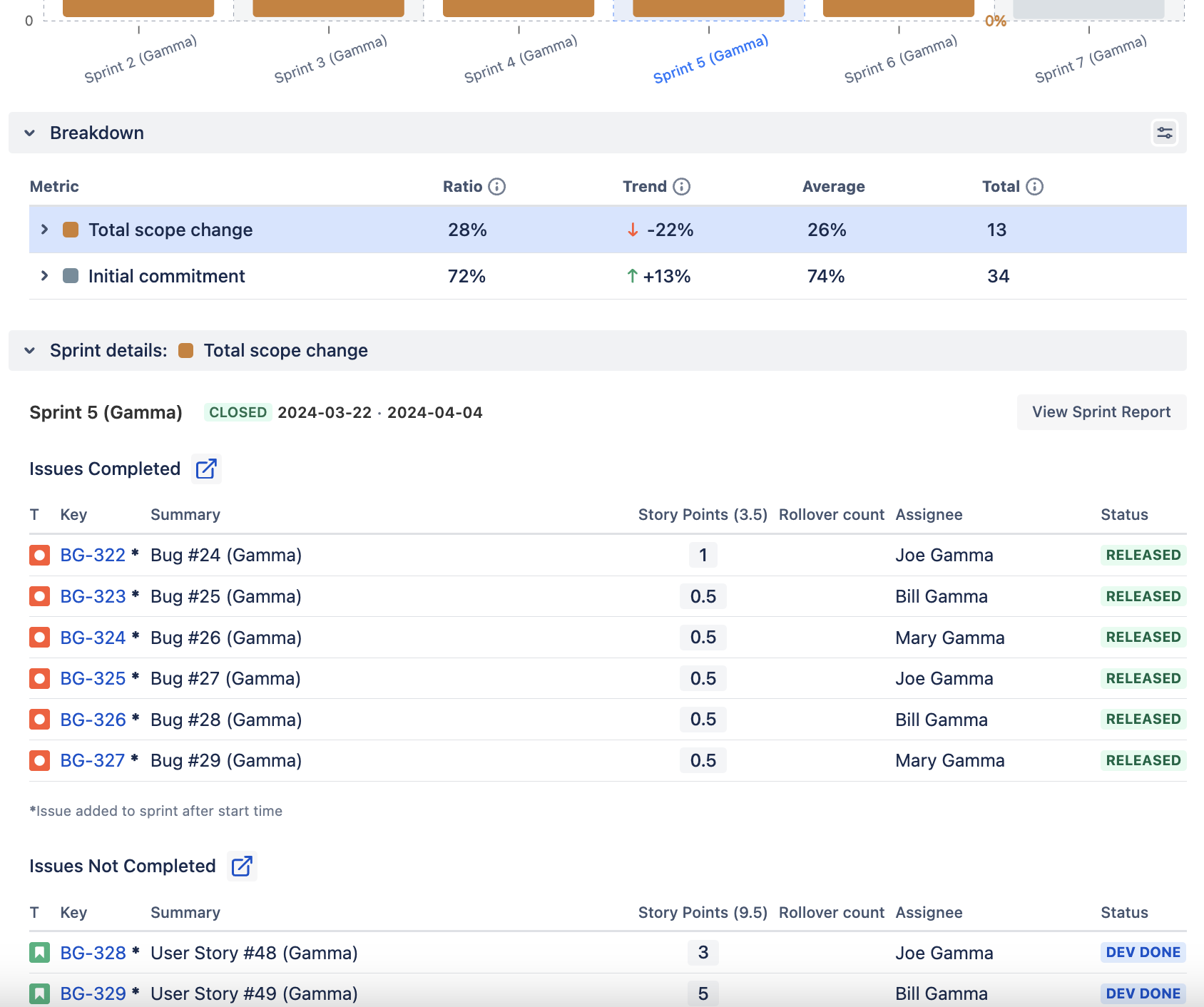
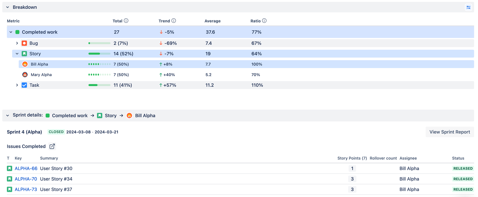
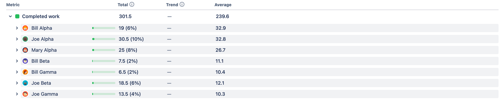
To facilitate this process within Velocity Chart, we have added a Breakdown feature in the form of a table with collapsible sections.
To view the sprint breakdown, click on sprint or interval:
*If you need that feature in Burnup/Burndown charts, please let us know.
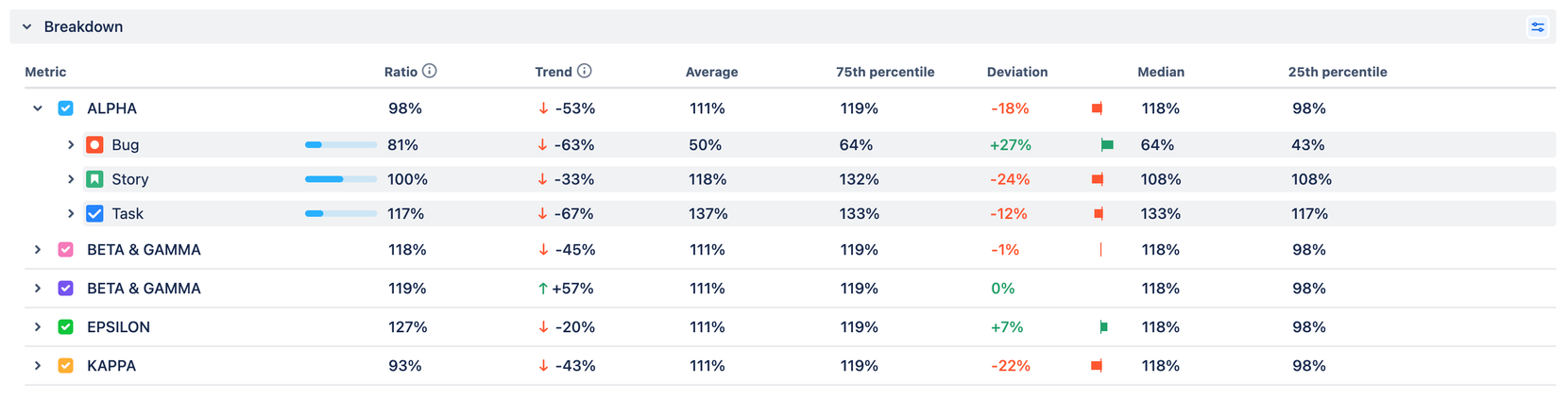
When broken down by issue parameters, the historical data shows the real picture of the selected interval on the chart, enriched with calculated metrics such as trend, average, and ratio (the latter is for Sprint Metrics only):
Users can manage metrics, chart type, and sprint breakdown configuration at the individual level. This means that their user settings only affect their view, and they do not need to change the settings for the chart. These adjustments are applied instantly:


When you select a segment in the breakdown table, you can view a filtered list of issues related to that segment. With this feature, you can use the chart to start a conversation, for example, during your retrospective meetings by bringing up a certain list of tickets:
Issue-Level Data
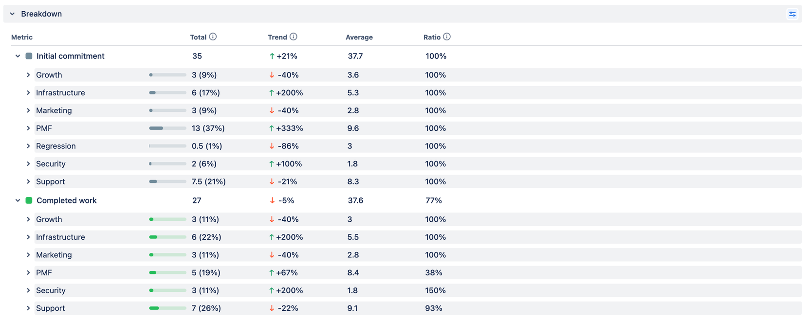
1. The "Issue Type" in Jira allows for the breakdown of work types, identifying whether tasks are intended to deliver new user value, solve technical challenges, or address fixes.
2. The "Status" represents the stage of the work at a specific time. The Initial Commitment captures the status at the start of the sprint; for other metrics, the status indicates where the work stood at the end of the sprint.
3. "Priority," when used correctly, provides a perspective on the relative importance of the work. If not utilized effectively, all tasks may appear to have the same priority, making it difficult to analyze from this point of view.
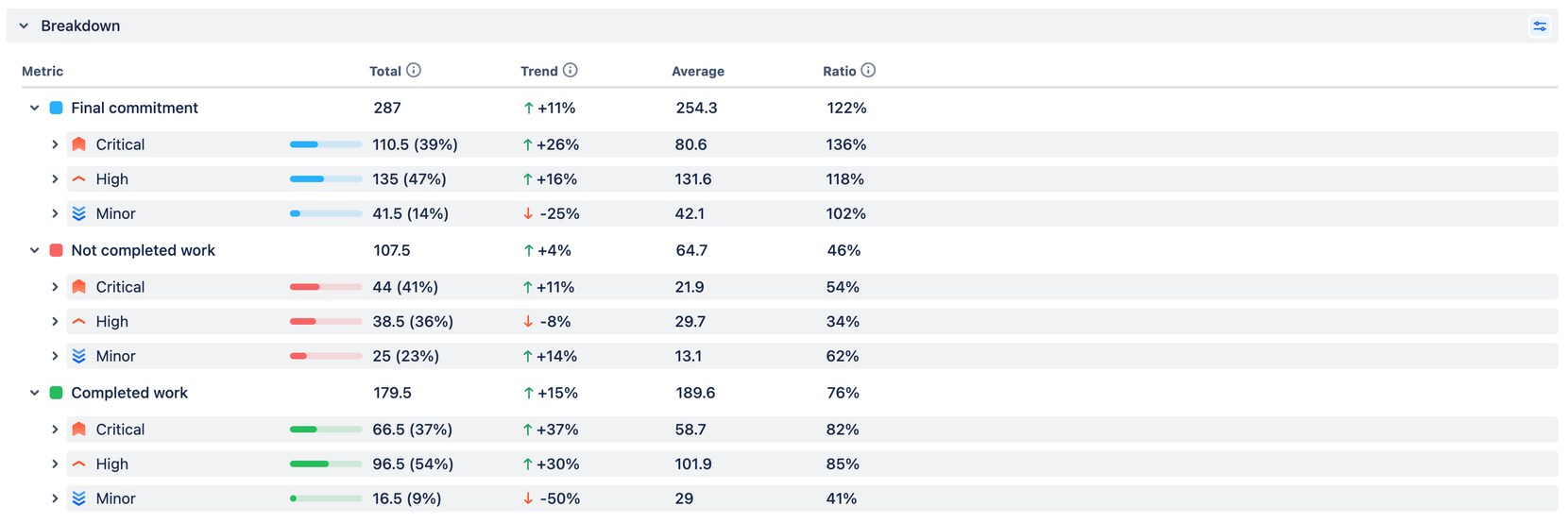
4. "Components" reflect the structural elements of a system, and in terms of delivery analytics, they can show where the focus is and the amount of effort allocated to different parts of a product or organization.
5. "Labels" function similarly to components but are much more flexible. They are commonly used to represent business or organizational abstractions, allowing for more precise categorization and analysis of issues.
Org-Level Data
1. In most cases, the board represents the team, making the team’s “scoreboard” accessible in charts that use Scrum or Kanban boards as data sources.
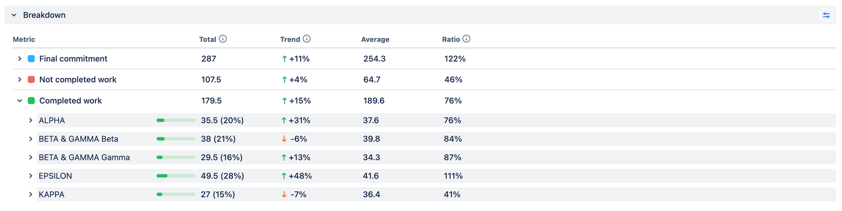
2. Every issue is associated with a project. Therefore, when utilizing a Velocity Chart for a board that aggregates issues from multiple projects in Jira, you can view how many story points are allocated to each project.
3. A breakdown by assignee provides individual insights into the delivery data, even when dealing with multiple teams.
4. Epics can also span across multiple teams, allowing you to monitor the progress of these cross-team entities on a larger scale.
5. Releases reflect a team's pulse, indicating how frequently it releases and how far it has progressed in the current release cycle. This insight gives an overview of the team's output rhythm and project milestones.
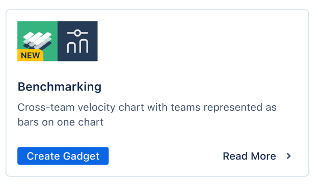
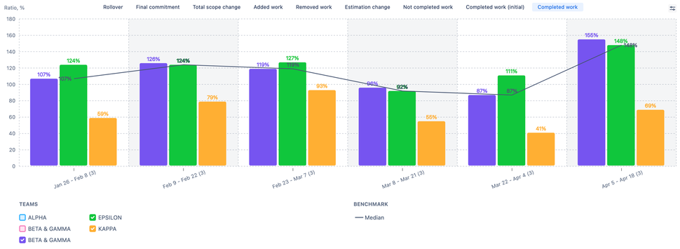
Benchmarking Chart
Just as you can't fully assess your health without matching your temperature with a 36.6 mark on the thermometer, you can't evaluate the delivery health of a team or across teams without analyzing delivery data and setting benchmarks. This is essential for measuring the outcomes of coaching or self-organization practices.
So we weren’t surprised by receiving numerous feature requests for completely new capabilities in detecting and monitoring healthy and unhealthy patterns, trends, and anomalies, as well as setting benchmarks and KPIs.
Our primary role as a reporting tool is to offer users a visual representation that helps them comprehend the data and serves as a starting point for meaningful conversations. That's why we've developed three new features for Velocity charts and introduced a new Benchmarking chart equipped with an advanced statistics toolset.
Velocity Chart's New Capabilities
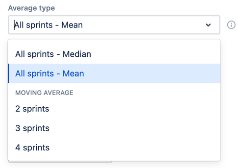
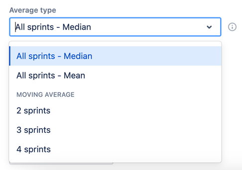
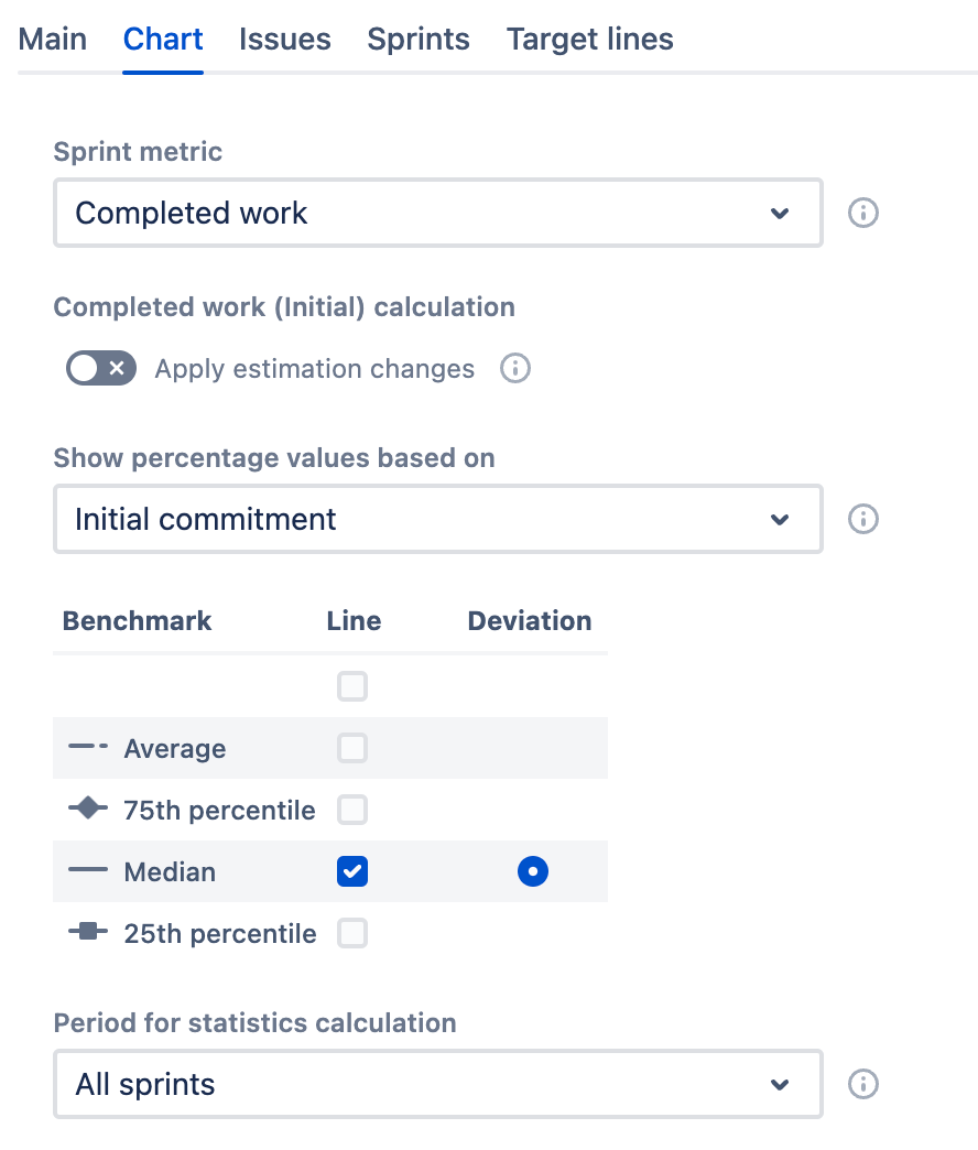
The median helps to avoid outliers when calculating the "average," making the benchmark more precise.
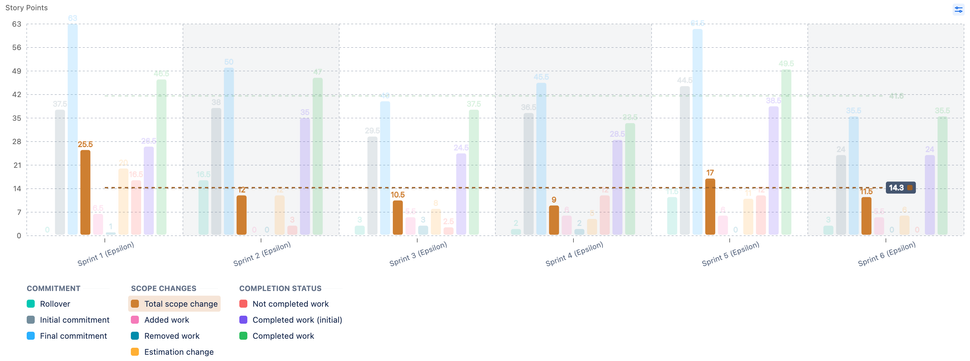
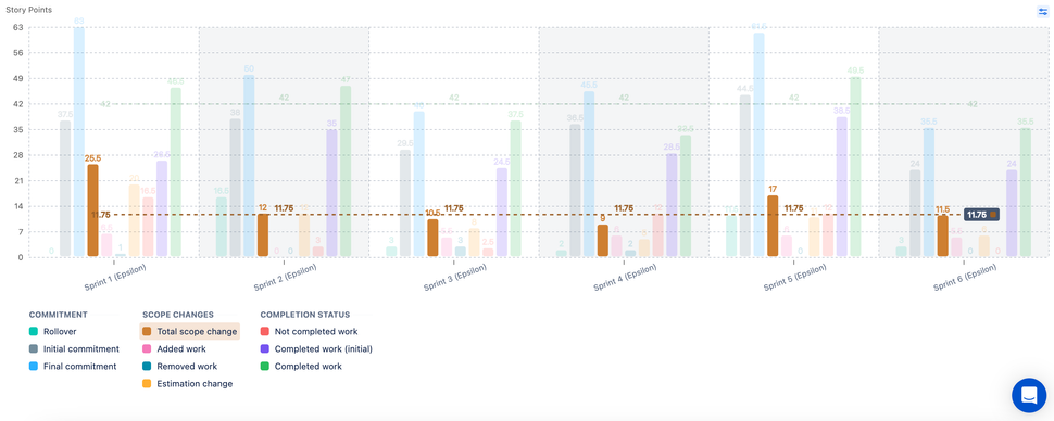
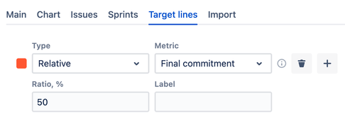
Relative target lines are an effective method for staying agile. They allow you to adjust your goals in relation to what you initially or finally committed to.
Setting the maximum chart height allows you to create dashboard gadgets with consistent heights, which makes visual pattern comparison easier.
Benchmarking Chart
ARG

VEL
This chart is similar to the Velocity Chart for Scrum Boards, but with a few notable modifications:
It includes advanced benchmarking tools alongside sprint metrics.
All teams are represented on a single chart, either as bars or lines.
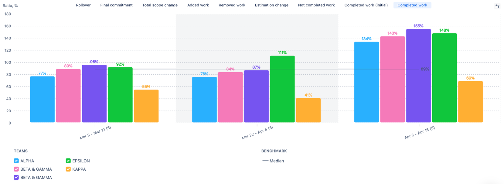
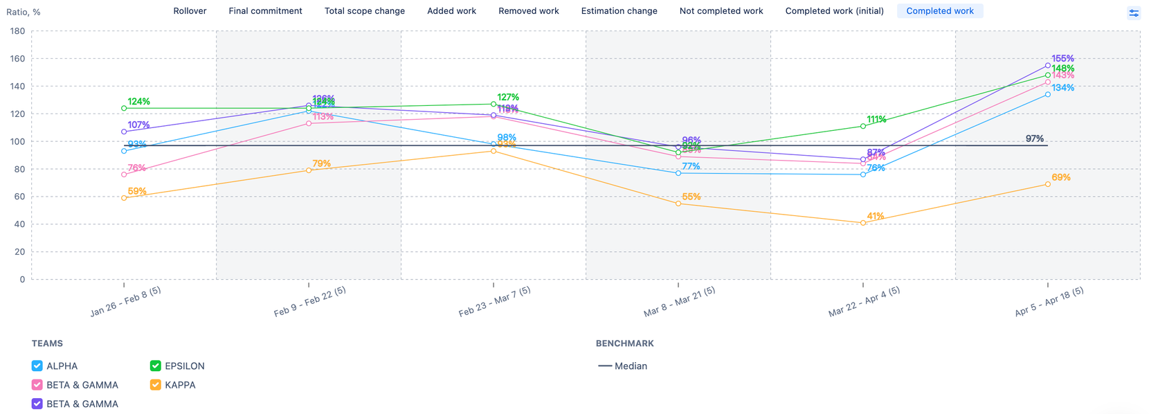
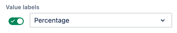
Percentage values are used by default to prevent misinterpretation of absolute values.
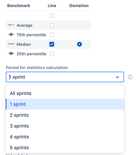
Benchmarking Tool Settings
- The average is calculated as a simple mathematical average.
- The 25th percentile, Median, and 75th percentile represent the top 25%, top 50%, and top 75% lines, respectively.
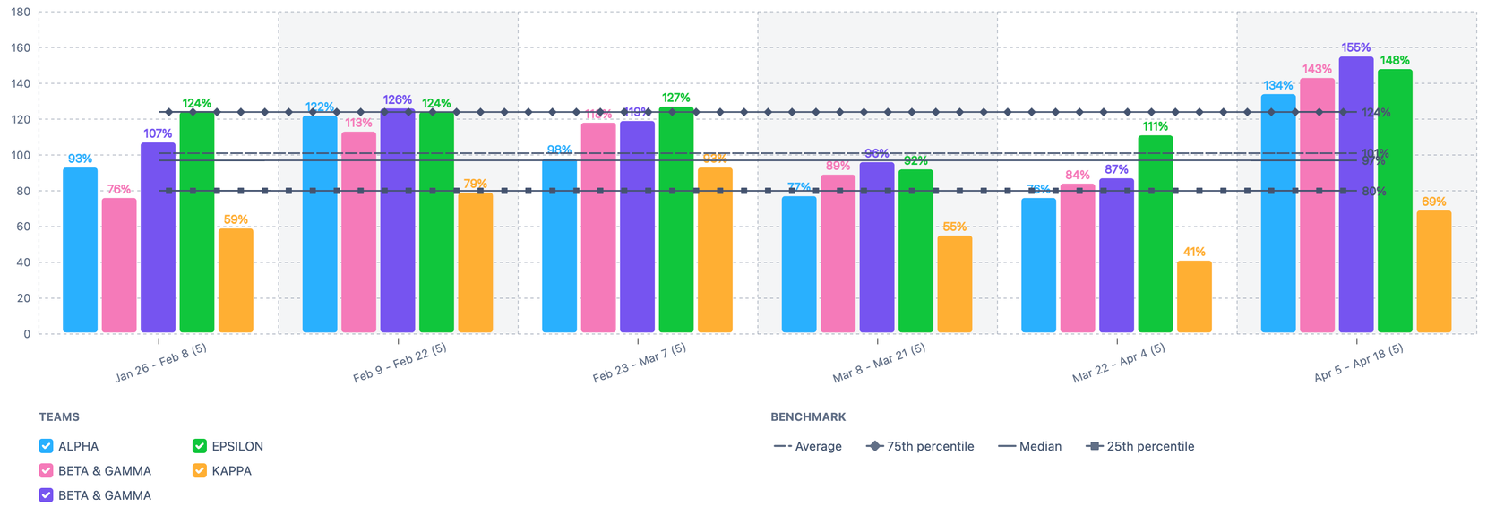
- You have the option to display Deviation for one of the selected benchmarks. This will appear in the breakdown as spark bars, indicating the percentage of value deviation from the selected benchmark.
- Users can manage the population sample by adding teams to the chart and selecting the number of intervals for calculation.
- Adding a single team to the chart allows you to see how the "normal" Say/Do and other metric ratios vary in the team's pattern.
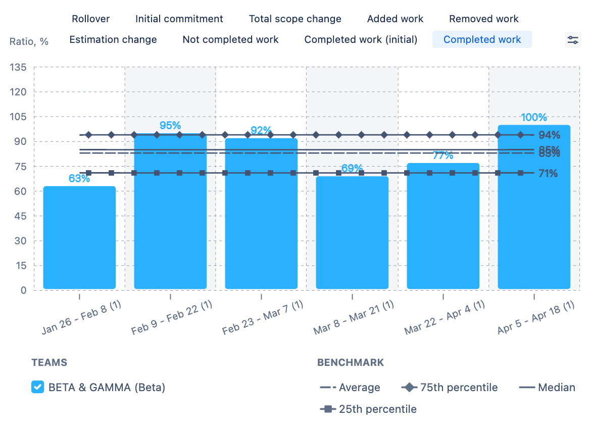
- Adding 1+ teams to the chart enables viewing of metric patterns at the cross-team level.
- The legend allows you to highlight or display any or all teams, which increases flexibility during live presentations.
- The breakdown table includes benchmarks and deviations for the selected benchmark.
The following features are exclusively available in the ARG (Agile Reports and Gadgets) app.
Board Sets
Every company, and often each business unit, maintains its own unique Jira setup. Some organizations use separate boards for each team, whereas others group multiple teams together on a single board and identify them by sprint names. Although most teams employ story points as their estimation units, the specific field names can vary—some use "Story Points," while others use "Story Point Estimate." While these variations may not seem important, they are actually crucial because, without accommodating these customizations, it's impossible to effectively aggregate cross-team data for display on charts. These minor discrepancies, however numerous they are, can significantly complicate data management.
The “Board sets” feature makes the aggregation of Sprint and Kanban metrics easier for large organizational units. It enables them to select multiple boards with detailed board settings as a single data source with just one click, streamlining the chart creation process.
Create Board Set
Users can add several boards with just one click in two ways:
1. Add the boards you need and save them as a board set in the settings as you go.
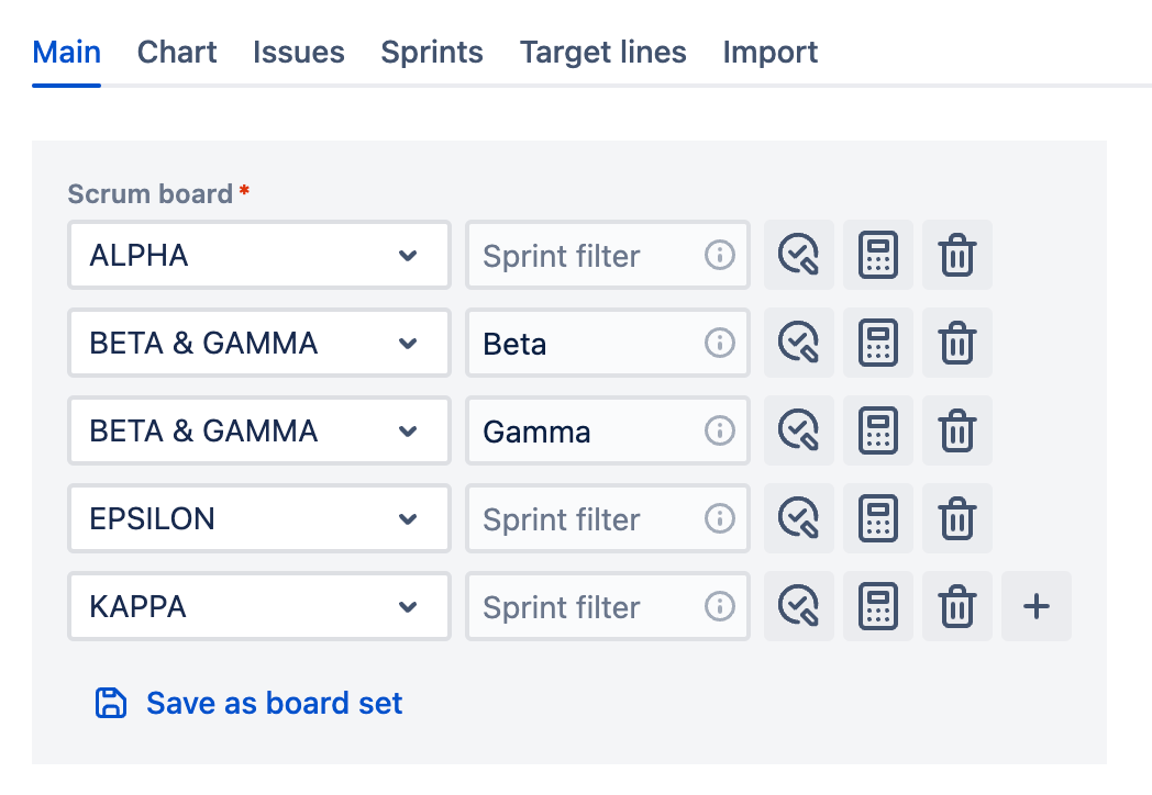
2. In the 'Board sets' tab, recreate your organizational structure and use it when creating charts.
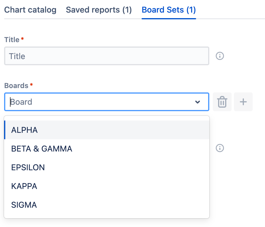
More details in [Using Board sets].
Board Configuration
These settings are applied by default when you add the board set to the chart.
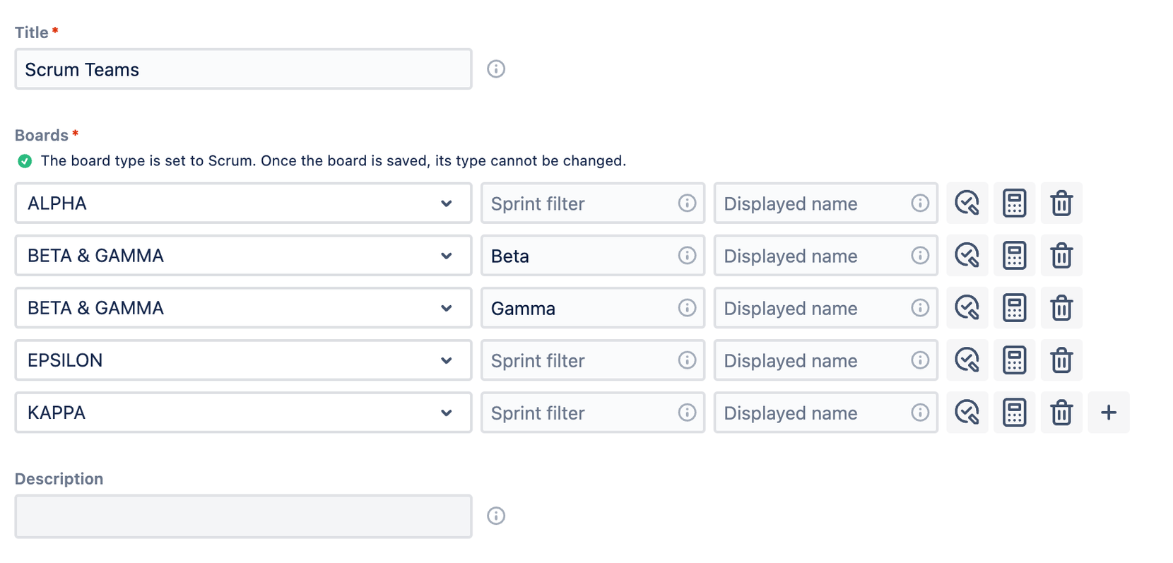
- Display Name: This name will be shown in Jira instead of the actual board name, making it easier to find if needed.
- Sprint Filter: This feature allows you to filter sprints based on their names, using regular expressions (regexp).
- Custom Estimation Field: Enables the use of any numeric field for calculations.
- Custom Done Status: This setting lets you choose one or more statuses to highlight work that is completed.
Program Increments, Initiatives, and Epics
Enterprises operating in multi-team environments typically face much longer planning horizons than SMBs. The forecasting process is based on a complex hierarchy that often extends two or three levels above the basic elements like stories, tasks, and bugs estimated in story points. This complexity forces companies to employ advanced JQL filters (such as Children of Children) and to develop calculation scripts (like summing story points in an Epic) to write data into custom fields. Therefore, keeping track of the progress of an Initiative usually requires several different Jira apps, which makes maintenance harder and can put a strain on the budget.
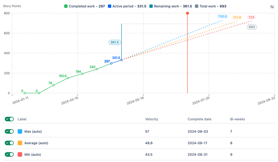
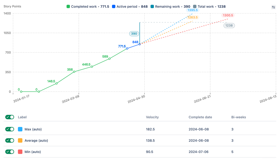
At the end of the day, the objective is to identify the target epics and calculate story points from their children (stories, tasks, and bugs). We have added two new Burnup charts and the ability to filter the forecasting scope to help with this complex task.
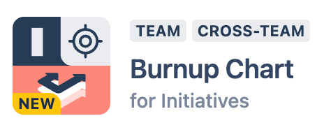
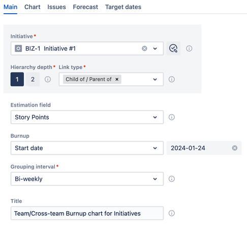
Burnup Chart for Initiatives
The Burnup chart for Initiatives can be used to plan, forecast, and track the progress of Program Epics, Initiatives, or any higher-level entity represented by a custom issue type. It is perfect for managing work above the Epic level.
Burnup Chart for Epics
Planning, making predictions, and keeping track of the progress of Epic groups are all easier with the Burnup chart for Epics. You can either use a static list of Epics or a dynamic JQL filter to identify the Epics that you need.
Custom JQL Filter for Remaining Work

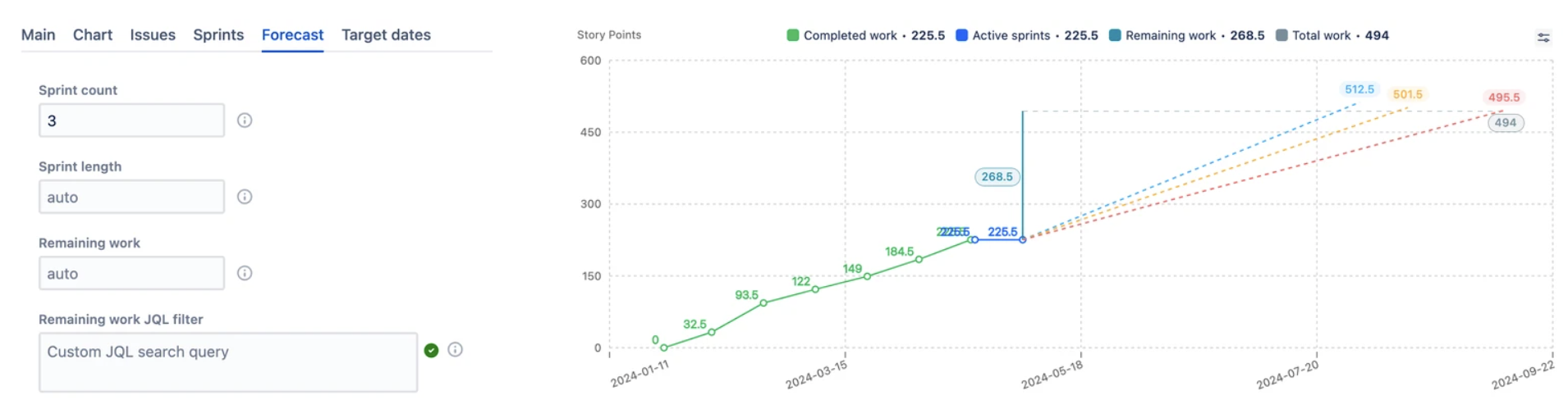
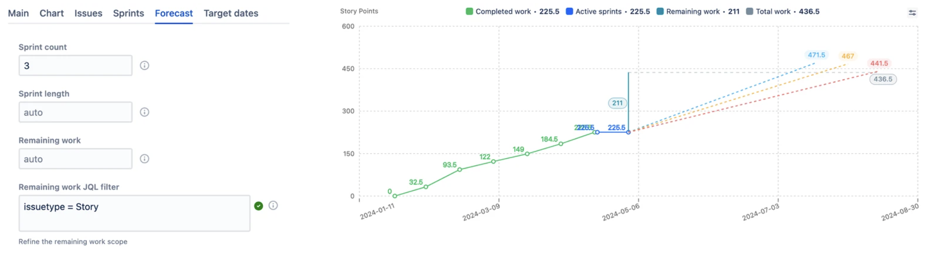
This feature allows you to view the expected completion date for a custom scope of remaining work defined by a JQL expression. Changes in progress and scope are automatically reflected in the chart.
Ready-to-Use Charts
Most of the time, different branches of enterprise companies use different apps for the same purpose simply because they are used to how one app works and do not want to waste time learning how to use a different one. On top of that, the sheer amount of customizations applied to the "Jira" environment makes it extremely complicated, which might be overwhelming for first-time app users. As a result, we have noticed a widespread desire for simple, one-button solutions that shorten the learning curve.
The fact is, to foster a data-driven culture among teams, the tool must be widely adopted. With that in mind, we have pre-defined the most optimal configurations for you. You simply need to select one or two fields to define a data source for the chart. To make setting up the chart even easier, we have highlighted these fields in the settings.
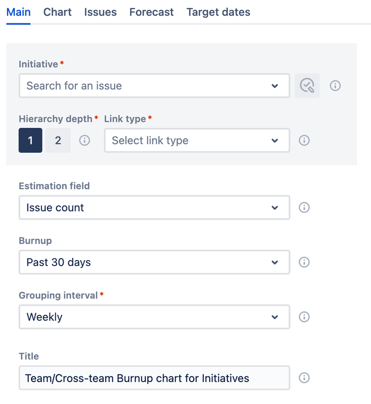
Chart Loading Enhancements
Your expectations for the amount of time it takes for a chart (or any app) to load are based on your past experiences. Most Jira users begin with Jira's built-in reporting tools or basic custom charts at the team level, where there is significantly less data to load and calculate compared to the cross-team level, such as environments involving 10+ teams. As a result, these initial experiences raised the bar, possibly too high for higher volume data environments. Imagine 10 teams' data aggregated on one chart. With all their worklogs. Naturally, the loading will take a “bit” more than on the team level.
Given that we load all issue workloads for retrospective calculations, chart loading times may exceed 30 seconds, especially in large instances with hundreds of thousands of tickets. We are actively working on this issue, trying to strike a balance between best practices and the need to avoid loading all instance data onto our servers.
Cache for Closed Sprints and Intervals
Once loaded, closed sprints or intervals are cached, enabling them to appear on the chart much faster than active sprints or intervals. This caching significantly accelerates the retrieval and display of historical data.
Active and Future Sprints Lazy Loading
The loading of active sprints/intervals and remaining work does not prevent the chart from being displayed. This allows you to analyze data before all components are fully loaded, creating a smoother experience.
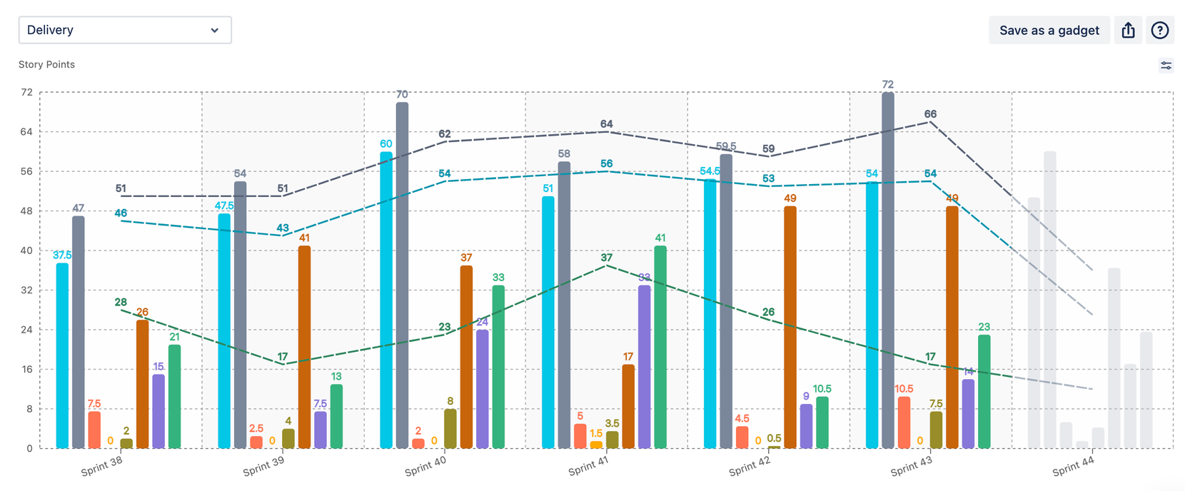
Chart Loader Tips
For charts you monitor weekly, a loading time of up to one minute is likely acceptable, as it allows you to work with the chart subsequently without needing any reloads. To improve the user experience while you wait, we provide tips and updates on the loading screen to entertain and inform you.

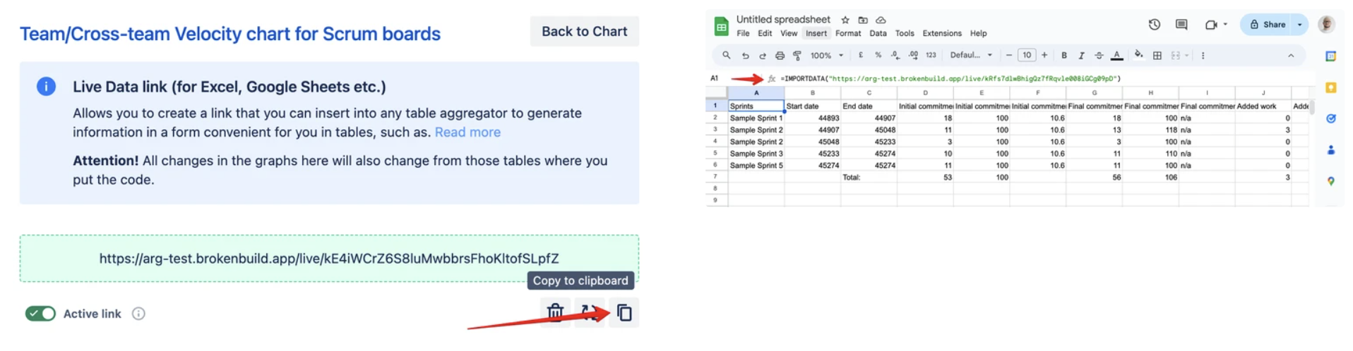
Live Data Link
When exporting a CSV file with chart data to use externally, users often want these numbers to be automatically updated. To address this need, we have developed the Live Data Link feature.
After configuring your chart correctly, you can generate a Live Data Link in the Export section:
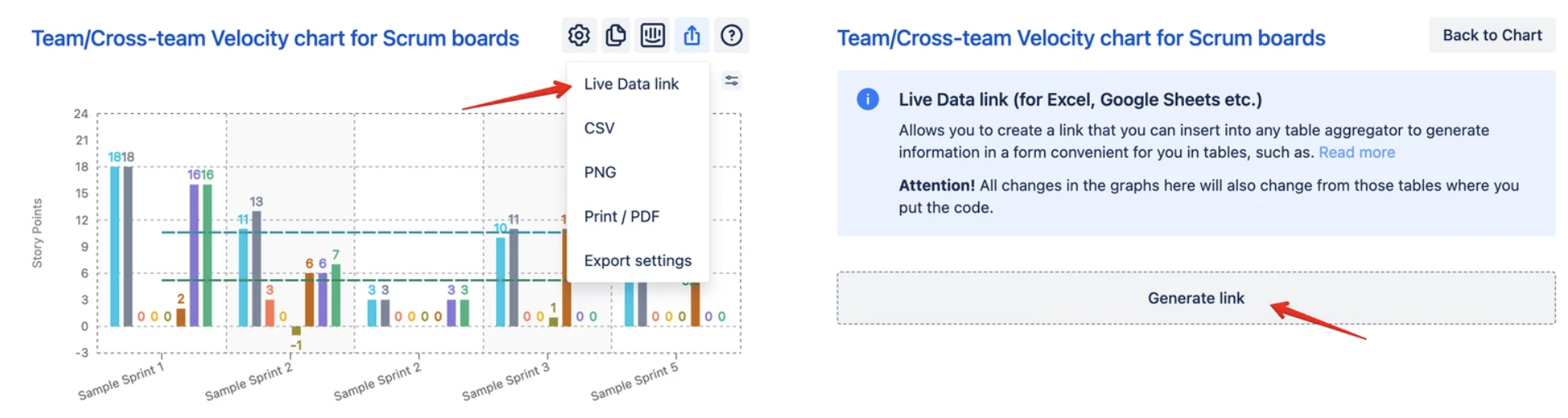
Upon request, the link provides access to the same CSV file as the Export feature. This link makes automation easier by allowing users to get real-time updates directly from the chart.
For additional information, please refer to the article.
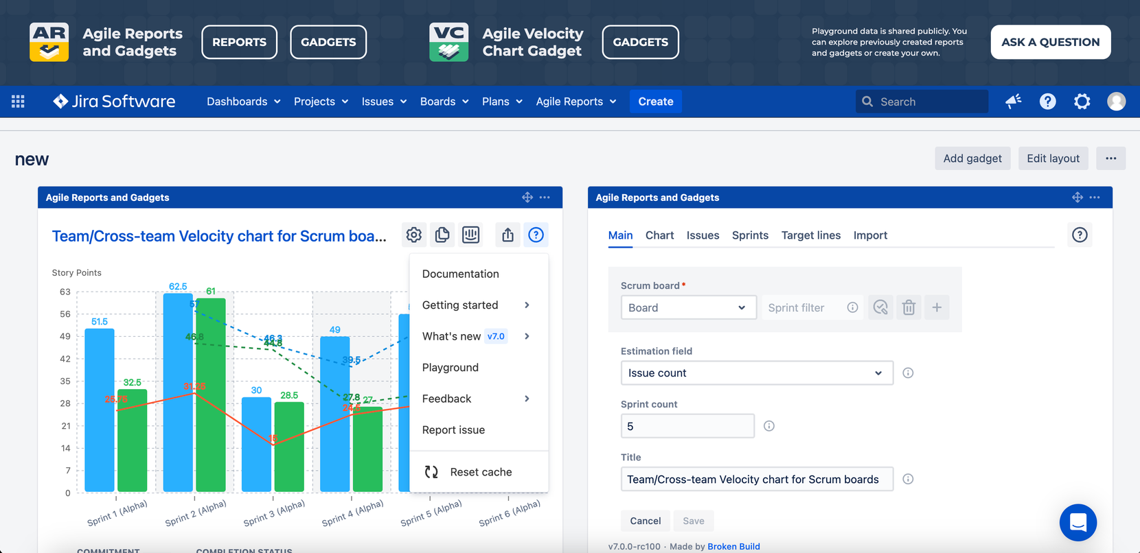
New Product Updates and Playground
With the release of ARG 7.0 and VEL 6.0, we have enhanced user support by introducing new features such as a video overview and an interactive playground. Users can explore updated products using test data, and a spotlight feature guides them to key functionalities, paving the way to the "a-ha" moment.
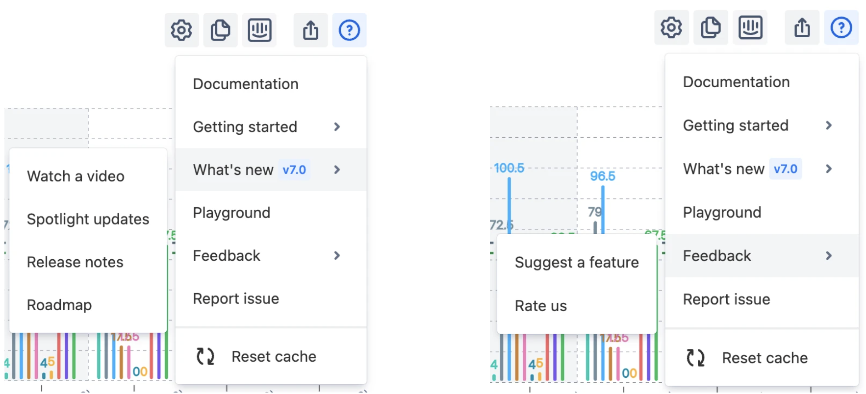
New Help Menu
We have standardized the help menu across our applications and emphasized the product update section. Here, users can learn more about new features by watching the video overview or engaging with the spotlight.
Interactive Playground
Accessible from the help menu, the playground allows users to interact with test data on previous dashboards and reports or to create their own. Get a feel for the product's features and functionality with this handy tool. Link to the Playground: Dashboard - Jira
To wrap up, the enhancements brought by ARG 7.0 and VEL 6.0 are geared towards making agile project management more intuitive and insightful. Ready to see these improvements in action? Visit the ARG and VEL pages on the Atlassian Marketplace to learn more and get started with these powerful new tools today.


.png)


.png)

