In this article
Jira users often rely on native Jira solutions to measure cycle time. The most popular one is called the Jira Control Chart and it shows the time spent by each issue in a specific column over a set period of time. The chart also shows the average, standard deviation, and rolling average for the data. However, the Control Chart has serious limitations in its ability to calculate key metrics like cycle time, and despite numerous requests, this chart hasn’t been modified much over the years, so new apps started bubbling up on Atlassian Marketplace to provide more detailed cycle time analytics.
We’ll focus on the top three cycle time apps for Jira: Great Gadgets by Stonik Byte vs. Time in Status by SaasJet vs. Cycle Time Chart Gadget by Broken Build.
Great Gadgets vs. Time in Status vs. Cycle Time Chart Gadget
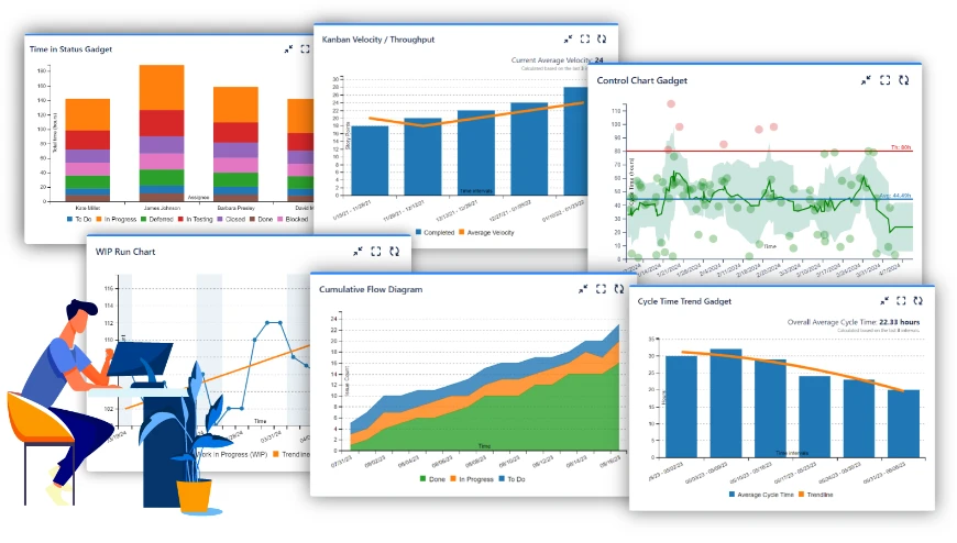
Great Gadgets by Stonik Byte
Great Gadgets includes a variety of reports and gadgets for release management. It is important to configure the gadgets to effectively display cycle time and lead time. For cycle time tracking, it offers four gadgets: a control chart (because classics never go out of style), a histogram chart, a cycle time trend, and a time in the status report. These charts are part of a huge set of reports for Agile analytics included in the Great Gadgets app, but offer only basic information about cycle time - NO sophisticated configurations or filters included.
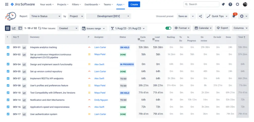
Time in Status by SaasJet
Time in Status is designed to track how long issues remain in each status. It'’s perfect for teams needing a straightforward solution for tracking time in status without complex setups. Time in Status comes with advanced calculation settings and filters, allowing you to measure cycle time and lead time accurately, and provides a bunch of ready-to-use reports, so you can start tracking cycle time right out of the box.
Cycle Time Charts Gadget by Broken Build
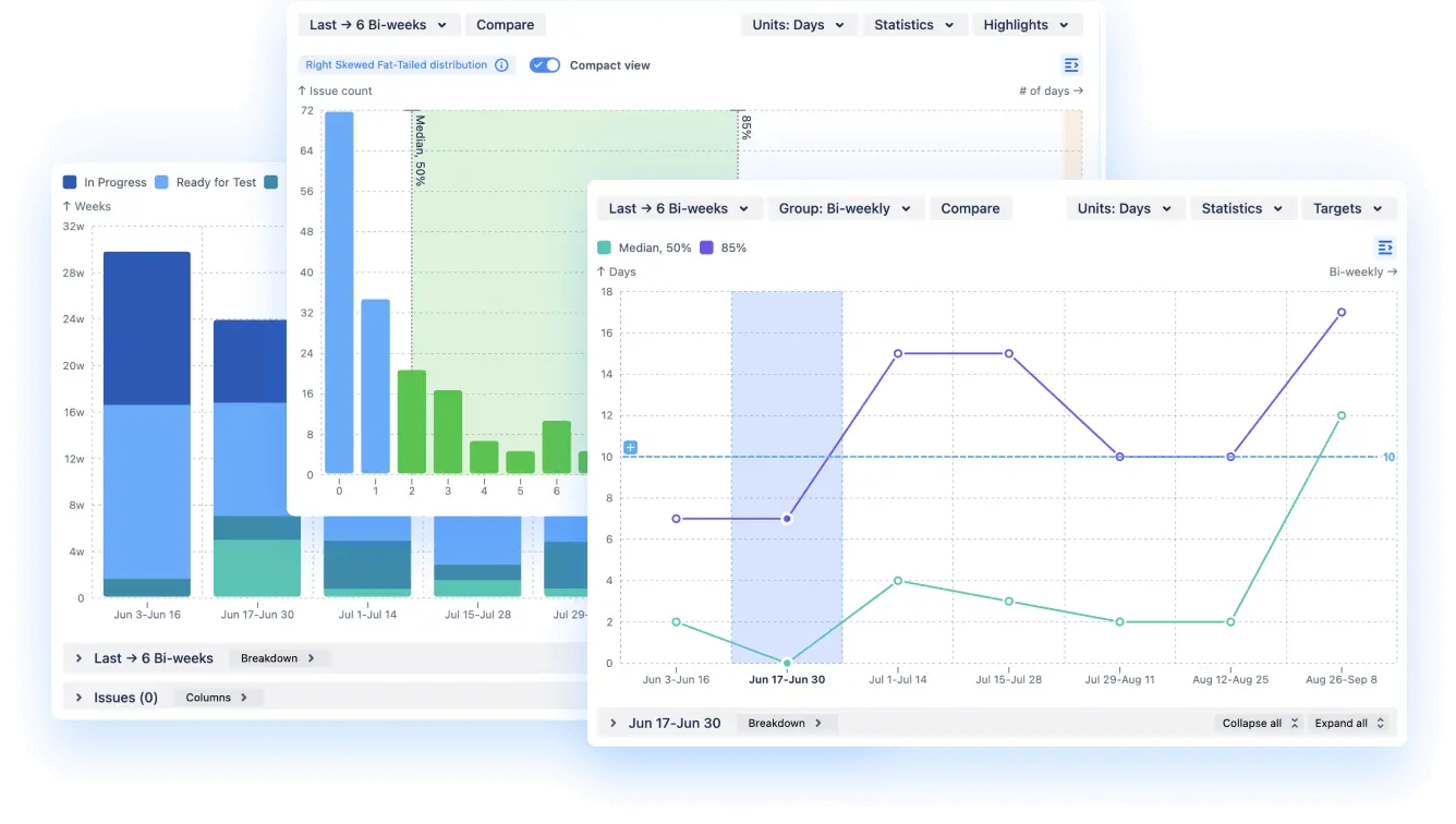
Cycle Time Chart Gadget is the most comprehensive app for cycle time tracking on Atlassian Marketplace. A cycle time histogram, a trend chart, and a time in status report are all rolled into one app - and you don't even have to leave your Jira dashboard to spot bottlenecks and fine-tune your processes. It also provides advanced filters, calculations, and breakdowns for a detailed picture of your cycle time. Cycle Time Chart Gadget is perfect for big, complex organizations because it can handle data from multiple teams and even SAFe entities.
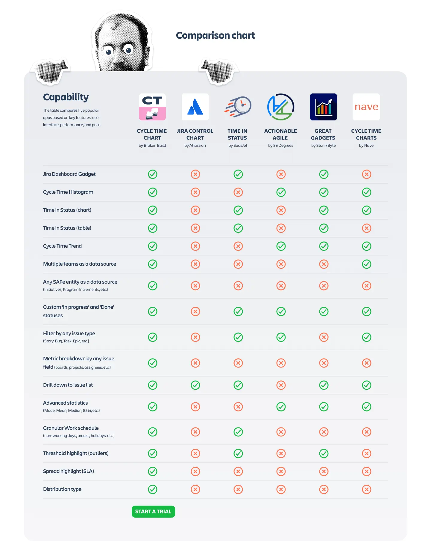
Now, let's get into the nitty-gritty and see how these apps stack up against each other:
Tracking cycle time in Jira dashboard
Cycle Time Chart Gadget is the most comprehensive app for cycle time tracking on Atlassian Marketplace. A cycle time histogram, a trend chart, and a time in status report are all rolled into one app - and you don'’t even have to leave your Jira dashboard to spot bottlenecks and fine-tune your processes. It also provides advanced filters, calculations, and breakdowns for a detailed picture of your cycle time. Cycle Time Chart Gadget is perfect for big, complex organizations because it can handle data from multiple teams and even SAFe entities.
Now, let’s get into the nitty-gritty and see how these apps stack up against each other:
Having everything right in your Jira dashboard means you can see important data without jumping around different tools. These displays allow users to sort and analyze data trends, providing insights into team performance and issue resolution over specific time frames. This keeps everyone on the same page, allows for easy data comparison, and makes decision-making smoother.
Good news! All three apps play nice with your Jira dashboard, but each has a slightly different setup. Great Gadgets has a separate gadget for every chart, so you will have 3 gadgets to have a complete view of your cycle time.
Cycle Time Chart chose a different approach, keeping all charts in one gadget so once you added the datasource, you can easily switch between them inside Jira gadget. They’re also interactive - settings are conveniently placed next to the charts, and the view adjusts as you change the settings.
SaasJet’s app also offers a single gadget for the Jira dashboard but without interactive elements—confirming its status as a reliable old-school Jira tool.
Availability:
- Great Gadgets: ✅
- Time in Status: ✅
- Cycle Time Chart: ✅
Charts for cycle time analytics
Cycle time and lead time analysis help teams identify bottlenecks and improve workflow efficiency.
When it comes to visualizing cycle time:
- Great Gadgets and Cycle Time Chart both give you histograms and trend charts.
- Time in Status is more focused on... well, time in status (shocker, I know).
Cycle time distribution (histogram)
Shows how long tasks usually take, helping you spot any weird patterns. Tracking the start and end dates for items in a workflow is crucial for monitoring project progress and extracting valuable data for analysis.
- Great Gadgets: ✅
- Time in Status: ⛔
- Cycle Time Chart: ✅
Time in status tracking
Tracking time spent in each status helps identify where tasks are getting delayed by analyzing workflow statuses, improving overall efficiency.
Time in Status (chart):
Visualizes how long issues stay in each status, helping to quickly spot bottlenecks.
- Great Gadgets: ✅
- Time in Status: ✅
- Cycle Time Chart: ✅
Time in Status (table):
Provides a detailed breakdown of time spent per status for a more granular view.
- Great Gadgets: ⛔
- Time in Status: ⛔
- Cycle Time Chart: ✅
Cycle time trend chart
Lets you track changes over time to see if your process tweaks are working. Using historical data to make predictions about future cycle times is crucial for planning and improving operational efficiency.
- Great Gadgets: ✅ (only average cycle time)
- Time in Status: ⛔
- Cycle Time Chart: ✅ (both average and percentiles, giving more reliable insights)
Multiple data sources
Pulling data from multiple teams or agile entities gives you a big-picture view, which is incredibly helpful for larger projects. So, if you're dealing with a bunch of teams or SAFe stuff, Cycle Time Chart is your go-to. The other two are a bit more limited in this department.
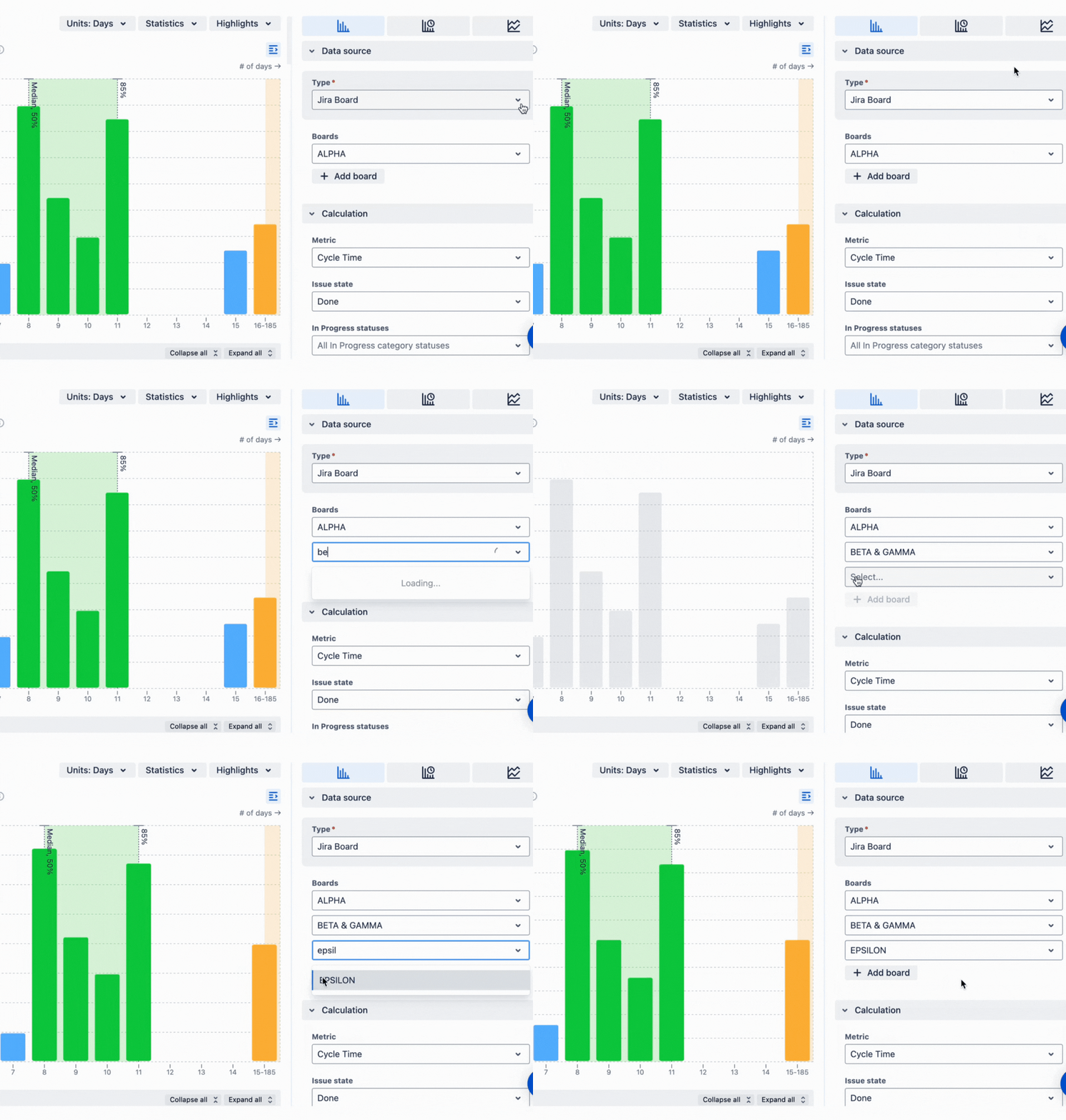
Multiple teams as a data source
(supports data from various teams, allowing for cross-team performance analysis).
- Great Gadgets: ⛔
- Time in Status: ⛔
- Cycle Time Chart: ✅
Any SAFe entity as a data source
(includes data from SAFe entities like initiatives, which is great for scaled agile setups.)
- Great Gadgets: ⛔
- Time in Status: ⛔
- Cycle Time Chart: ✅
Cycle time breakdown and filtering
Being able to customize statuses and filter issues means the tool can fit exactly how your team works, making tracking more accurate. All three apps let you set up custom statuses and drill down to the issue list, but Cycle Time Chart goes the extra mile: it lets you break down metrics by any field you want.
This breakdown includes 2 levels of data, so you can break down combinations to inspect each metric in detail. For example, you can break down cycle time by issue type + on assignee to see how the tasks are distributed inside the team.
But where Cycle Time provides a breakdown, Time in Status offers a set of pre-defined reports, from Status Duration Report (tracking time spent in each status) to Assignee Report (time spent by each assignee), which you can customize, so you will also be able to dive deep into your cycle time - just from the other side.
Custom 'In Progress' and 'Done' statuses
You can set up stages that perfectly match your team'’s workflow. Using JQL queries, automatically generated by the dashboard gadget to filter and display Jira issues is crucial for effectively using Jira's capabilities in tracking and analyzing cycle times.
- Great Gadgets: ✅
- Time in Status: ✅
- Cycle Time Chart: ✅
Filter by any issue type
Helps narrow down data to specific types like bugs or stories.
- Great Gadgets: ⛔
- Time in Status: ✅
- Cycle Time Chart: ✅
Metric breakdown by any issue field
Allows breaking down each metric by different fields like boards or assignees, providing detailed insights.
- Great Gadgets: ⛔
- Time in Status: ⛔
- Cycle Time Chart: ✅
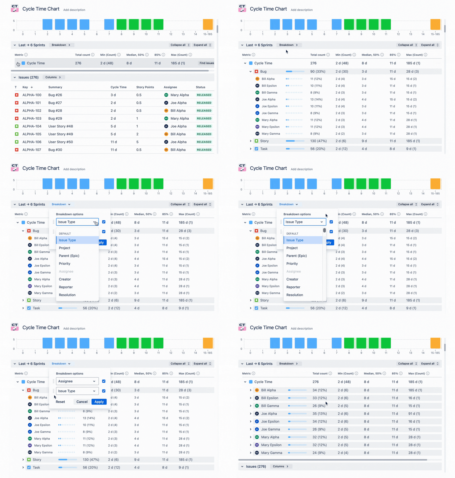
Drill down to issue list
Lets you explore detailed lists of issues behind each status for better analysis.
- Great Gadgets: ✅
- Time in Status: ✅
- Cycle Time Chart: ✅
Advanced cycle time features
Advanced features like stats and scheduling give deeper insights, helping you make smarter decisions about improving processes. Great Gadgets and Cycle Time Chart are neck and neck here, offering fancy stats and adjusting for your work schedule. Cycle Time Chart edges ahead with some extra bells and whistles like SLA highlights and distribution type analysis, making it easier to understand and visualize data.
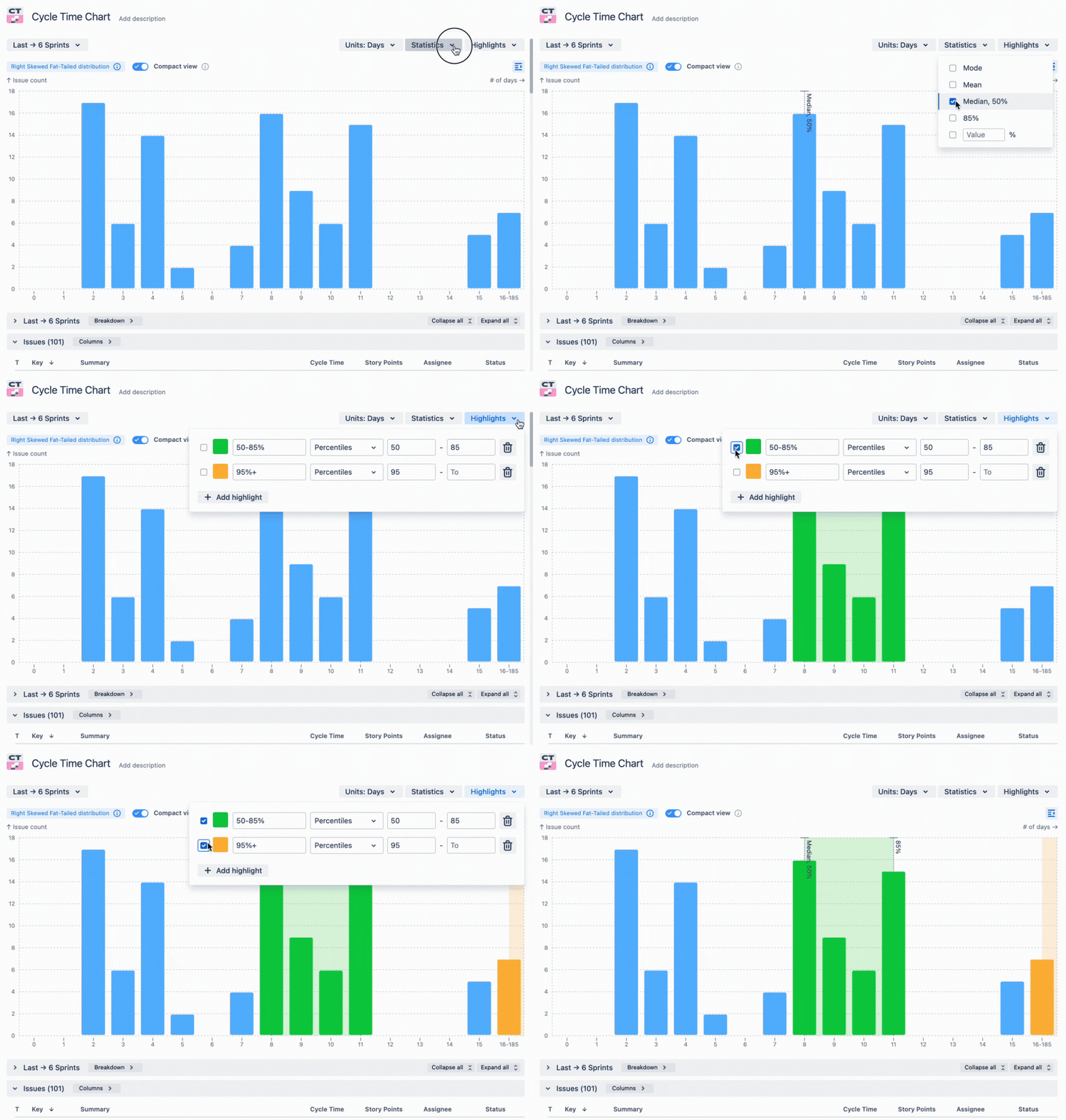
Cycle time statistics
Offers tools like mean and median calculations based on date ranges to really dig into data.
- Great Gadgets: ✅
- Time in Status: ⛔
- Cycle Time Chart: ✅
Granular work schedule
Adjusts for non-working days, so your cycle time calculations are spot on.
- Great Gadgets: ✅
- Time in Status: ✅
- Cycle Time Chart: ✅
Threshold highlight (outliers)
Spots outliers so you can focus on areas that need attention.
- Great Gadgets: ✅
- Time in Status: ✅
- Cycle Time Chart: ✅
Spread highlight (SLA)
Gadget displays highlights when service level agreements are met or missed, helping manage expectations.
- Great Gadgets: ⛔
- Time in Status: ⛔
- Cycle Time Chart: ✅
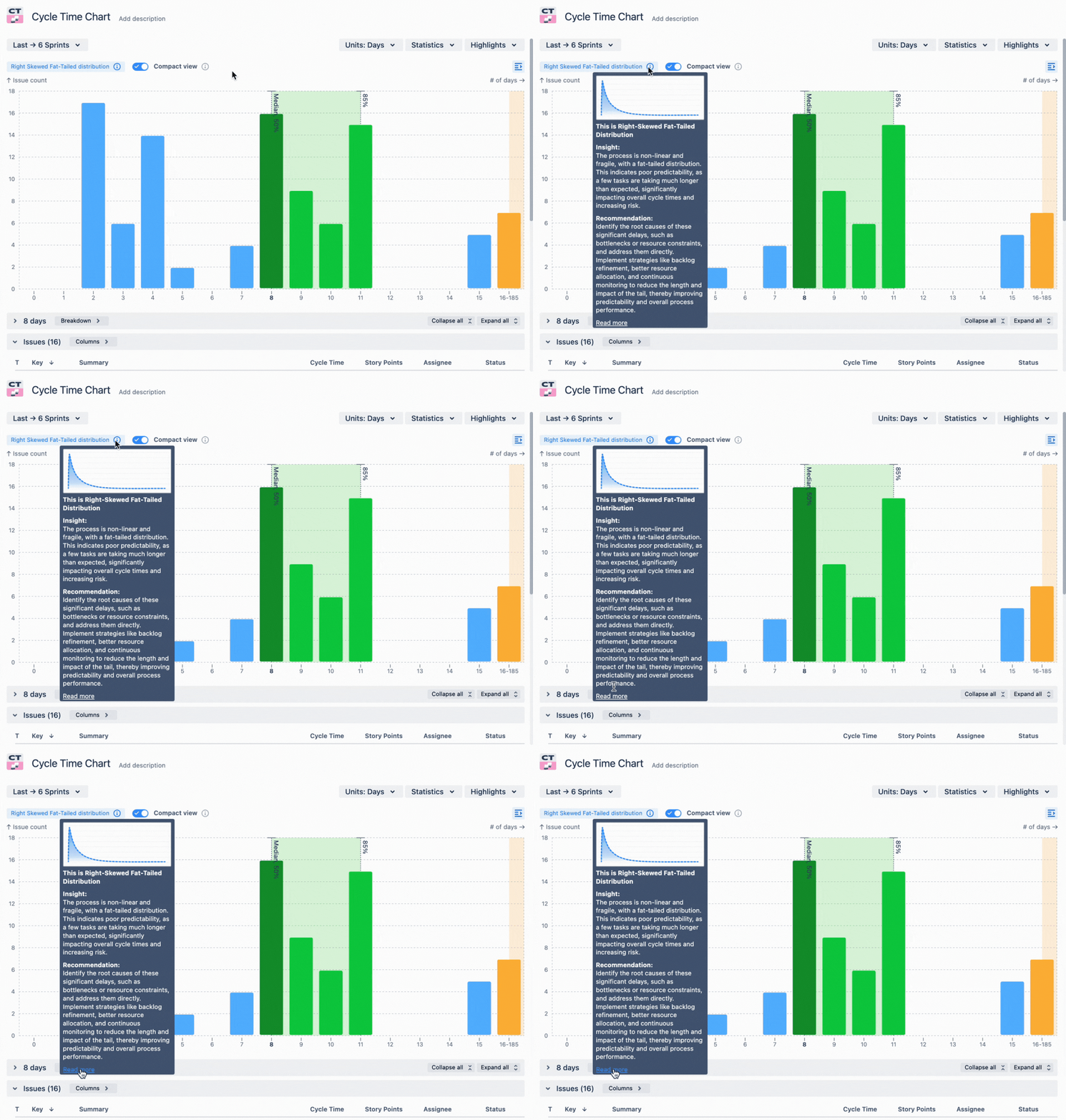
Distribution type
It helps you get the most out of the charts by interpreting the curves and giving useful tips.
- Great Gadgets: ⛔
- Time in Status: ⛔
- Cycle Time Chart: ✅
Apps to analyze cycle time in Jira: pricing comparison
Let's compare the price of the Stonik Byte, SaasJet and Broken Build cycle time chart apps.

Choosing a cycle time chart for your Jira
Choosing between these apps is like picking a smartphone – it depends on what you need:
- If you want a solid all-rounder, Great Gadgets has got you covered, as it has a variety of charts and reports for any need. But getting it only for its cycle time gadgets might be too expensive.
- For a no-fuss solution focused on status times (and nothing else), Time in Status is your best bet.
- If you're after the whole enchilada with all the trimmings, Cycle Time Chart Gadget is the way to go. But it doesn't mean that if you only need a Cycle Time Trend Chart or Time in Status Report you need to search for a more specific app. Getting Cycle Time Chart Gadget still makes sense, as you get the entire cycle time analytics suite for a fraction of the price of other apps.
Whichever you choose, you'll be giving your Jira setup a serious upgrade in the cycle time department.
FAQ
What is cycle time in Jira?
Cycle time refers to the total time it takes for an issue to move from the start of the workflow to completion. It helps teams understand their efficiency and identify bottlenecks in their processes.
Why should I use a third-party app for cycle time analysis?
While Jira's native Control Chart provides basic insights, third-party apps often offer more advanced features, customization options, and better visualizations that can help you analyze and improve your workflow more effectively.
What are the top cycle time apps for Jira?
The top three cycle time apps in Jira are:
- Great Gadgets by Stonik Byte
- Time in Status by SaasJet
- Cycle Time Chart Gadget by Broken Build
Can these cycle time apps integrate with my existing Jira dashboard?
Yes! All three cycle time charts can be integrated into your Jira dashboard, allowing you to view important data without switching between different tools.
Are these cycle time apps available for both Jira Cloud and Data Center?
Yes! Great Gadgets, Time in Status by SaasJet and Cycle Time Chart Gadget by Broken Build are available for Jira Cloud, Server, and Data Center environments. Always check the specific app listings for compatibility details to ensure they fit your setup.
Are there any costs associated with these apps?
Yes, these cycle time chart apps are not free (at least for teams under 10 ppl), but they offer free trials so you can start small. Check each app's listing for specific pricing details. This is the pricing calculator for the Cycle Time Chart by Broken Build.
How can I determine which app is best for my team?
Consider your team's specific needs—like the level of detail required, the complexity of your projects, and whether you need multi-team support. You might also want to try out a couple of them using free trials to see which one fits best.


.png)



.png)

