Thank you! Your submission has been received!
Oops! Something went wrong while submitting the form.
Thank you! Your submission has been received!
Oops! Something went wrong while submitting the form.
In this example

Kanban velocity report

Interactive Chart Example
info
The interactive chart is available on larger screens
Please open this page on a desktop to try it out

Key features of Kanban velocity chart

The Kanban velocity chart provides a consolidated view of completed work over time, helping you track velocity trends, compare performance across one or multiple Kanban teams, and spot changes in delivery stability.

With configurable breakdowns, issue lists, custom “done” statuses, and advanced filtering, the chart supports transparent reporting and data-driven retrospectives - all available in the Agile Velocity Chart Gadget.

How different roles use Kanban velocity report

Delivery Leaders (Managers / RTEs): Track aggregated Kanban velocity across multiple teams to ensure alignment with program and portfolio goals. Use velocity insights to monitor delivery pace, evaluate overall team capacity, and communicate realistic expectations to stakeholders.

Service Delivery Managers: Monitor variability and stability of velocity in Kanban to identify bottlenecks and flow issues. Use velocity data to guide WIP discussions, balance demand vs. capacity, and support continuous improvement in delivery practices.

Agile Coaches: Leverage Kanban velocity trends to assess long-term delivery sustainability and organizational health. Apply insights during retrospectives and workshops to coach teams on achieving smoother, more predictable flow and scaling Kanban practices across teams.

Boost your team’s delivery insights with KANBAN VELOCITY CHART

1. Key feature: Kanban velocity measurement across one or multiple teams/boards

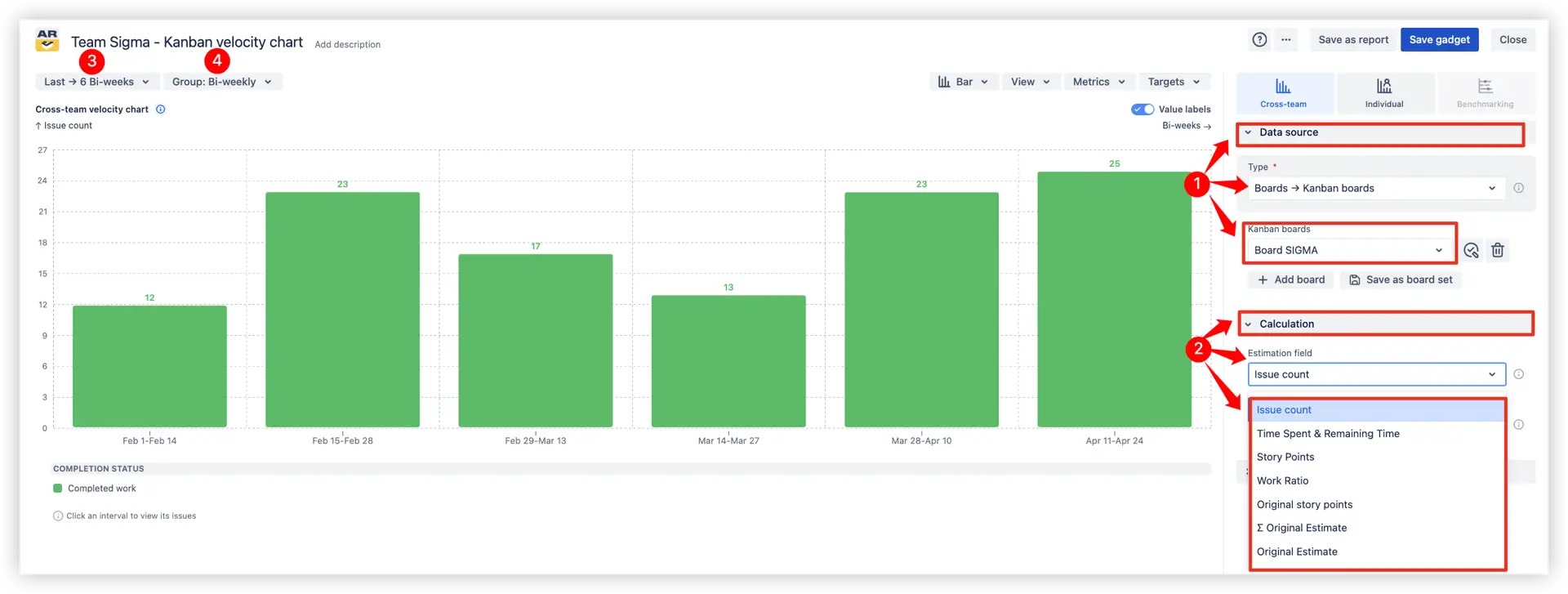
Kanban Velocity Chart helps teams and leaders understand how much work is delivered over chosen time intervals (weekly, bi-weekly, monthly, etc.).

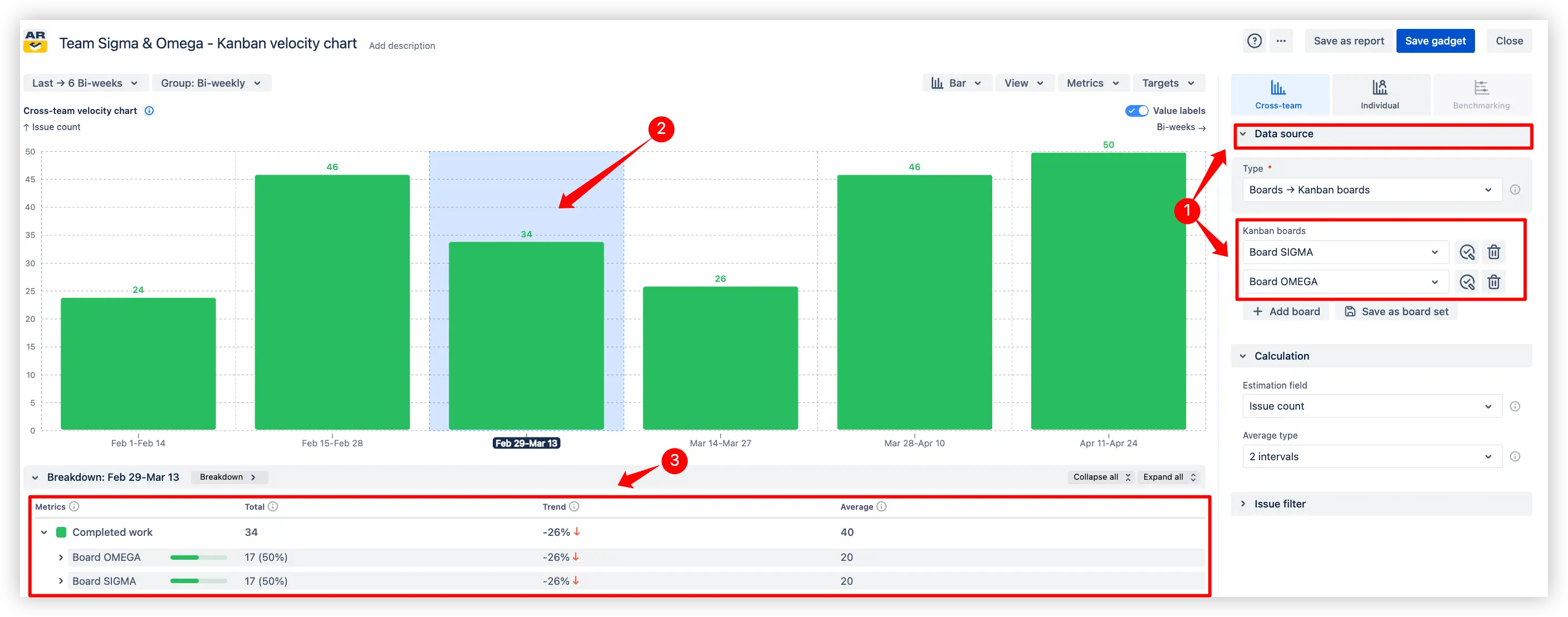
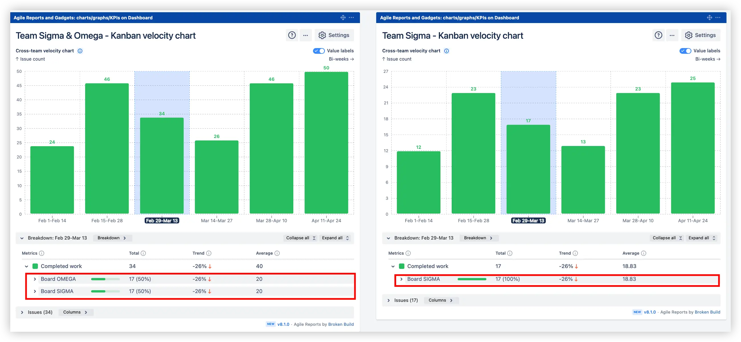
You can analyze velocity for a single Kanban board or aggregate results across multiple boards to see a bigger picture.

👤 One Kanban team (one board)

Track Kanban team velocity trends over time with completed work metrics (issue count, story points, or time estimates).

⚙️ The main settings to specify are:

  1. Choose a Kanban board
  2. Choose “Estimation field,” which can be Story Points, Issue count, Time estimates, or any Jira numeric field
  3. Choose the reporting period
  4. Choose how you want to group time intervals (e.g., weekly, bi-weekly, monthly, etc.)
Kanban team velocity for one board in the Jira dashboard
📊 How to read the chart:
The chart is simple; it shows: “Completed work” metric for Team Sigma (1️⃣) in Issue count (2️⃣) for the last 6 Bi-weeks (3️⃣), grouped Bi-weekly (4️⃣).

👥 Multiple Kanban teams (multiple boards)

Visualize aggregated velocity with a breakdown by team boards. Compare Kanban velocity, detect imbalances, and adapt planning to reflect real delivery capacity across teams.

⚙️ Settings difference: In addition to selecting the main board, add one or more extra Kanban boards to the configuration. This enables cross-team velocity tracking with a side-by-side breakdown.

Multiple teams/boards Kanban velocity chart in Jira dashboard

💡Tip: Compare Kanban velocity metrics across one or multiple teams to see trends and planning accuracy directly on your Jira Dashboard:

Multiple Kanban velocity gadgets on the Jira Dashboard

With these insights, you can:

  • Track Kanban velocity trends for a single team to see how delivery pace evolves over time
  • Compare aggregated Kanban velocity across multiple teams and identify imbalances
  • Detect fluctuations and variability that point to bottlenecks or unstable flow
  • Adapt planning based on real delivery velocity instead of assumptions

💡 Why it’s useful: This feature helps Delivery Leaders, Service Delivery Managers, and Agile Coaches monitor team health, uncover systematic inefficiencies, and improve predictability by relying on actual Kanban velocity data, enabling more effective flow reviews and continuous improvement practices.

2. Key feature: Kanban teams' velocity with moving average

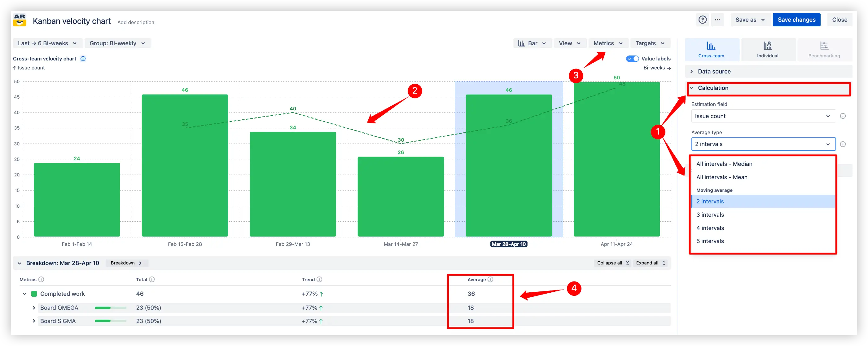
Smooth out short-term fluctuations in the velocity by adding a moving average line to the Kanban velocity chart. This makes long-term delivery patterns easier to see and prevents being misled by temporary spikes or drops.

  1. Flexible setup: choose the number of intervals (2, 3, 4, 5, etc.) for the calculation
  2. Visual clarity: the dashed line represents the moving average over selected intervals
  3. On/off control: enable or disable the line anytime via the Metrics menu
  4. Breakdown section below: analyze average kanban velocity per team board, with trend percentage for comparison
Kanban velocity chart with moving average line in Jira

With these insights, you can:

  • Spot long-term delivery trends without being distracted by short-term fluctuations
  • Compare actual Kanban velocity against the moving average to evaluate stability
  • Detect periods of improvement or decline in delivery pace more clearly
  • Use smoothed data for more reliable planning and forecasting discussions

💡 Why it’s useful: The moving average line helps you focus on the real delivery pattern instead of short-term spikes or dips. By smoothing variability, it provides a clearer baseline for planning, makes forecasting more reliable, and highlights whether your Kanban team’s velocity is becoming more stable over time.

3. Key feature: Target lines for delivery expectations or KPIs

Add target lines to visualize delivery goals or minimum completion thresholds. This makes it easy to see whether the team (or multiple teams) meets expected outcomes for each time interval.
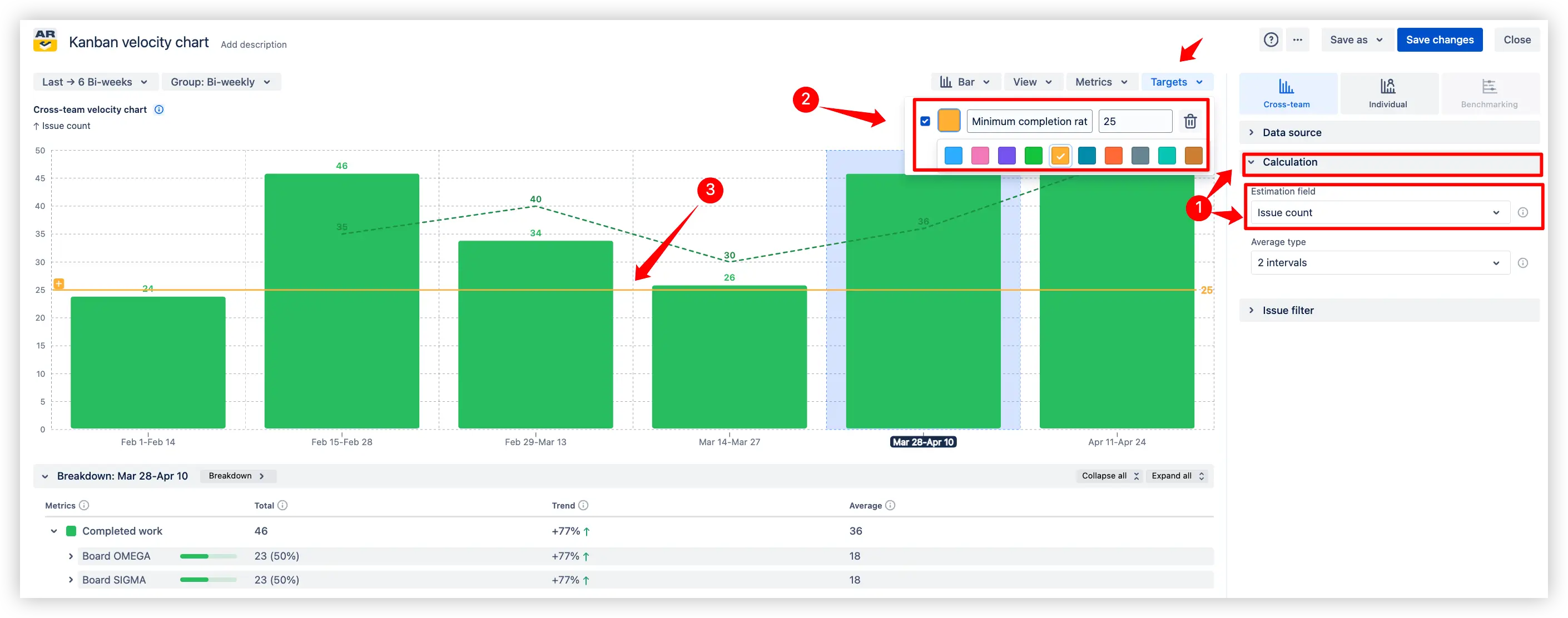
  1. Flexible setup: define targets in issue count, story points, or time estimates
  2. Visual guidance: red or custom-colored line across the chart highlights the expected delivery
  3. Performance check: instantly spot intervals where actual velocity drops below the target
Tracking velocity in Kanban with the Target line

With these insights, you can:

  • Set clear expectations for minimum delivery pace (e.g., 20 issues per interval)
  • Instantly see when velocity falls below defined targets
  • Track progress toward KPIs and align team focus on agreed goals
  • Use target lines as benchmarks to stabilize planning and delivery discussions

💡 Why it’s useful: This feature helps teams and stakeholders align on delivery expectations and monitor whether the flow is sustainable and meeting agreed goals.

4. Key feature: Issue filters and Breakdowns for deep analysis

Drill down into completed work by using any Jira field as a breakdown or applying filters directly in the Kanban velocity chart. This flexibility lets you analyze velocity in detail and focus on the work items that matter most.

Multi-level Issue filter

Use multiple criteria (e.g., Issue type, Epics, Releases) or JQL queries to tailor the Kanban velocity chart and get a detailed view of velocity drivers.

Multi-level Issue filter in the Kanban velocity report example

Breakdown and Issue list

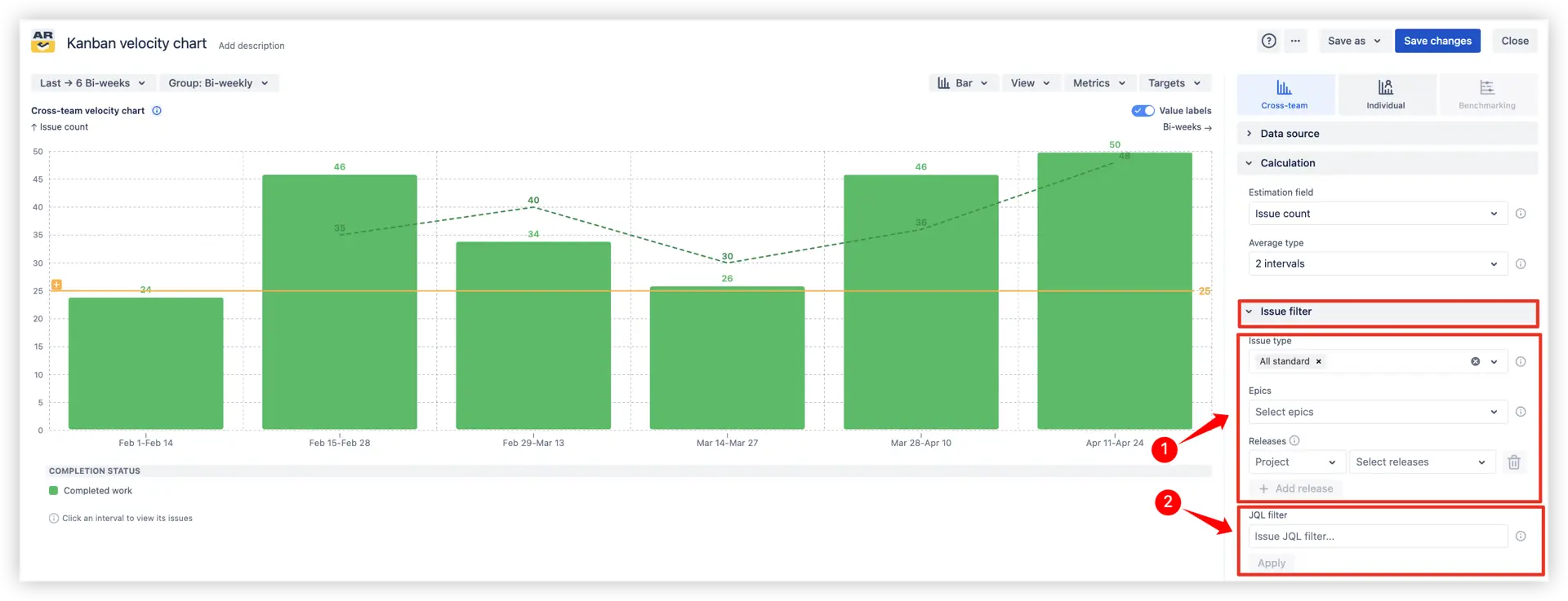
Go beyond high-level velocity metrics by exploring what’s inside the completed work. Breakdowns and issue lists help you connect aggregated data with real work items.
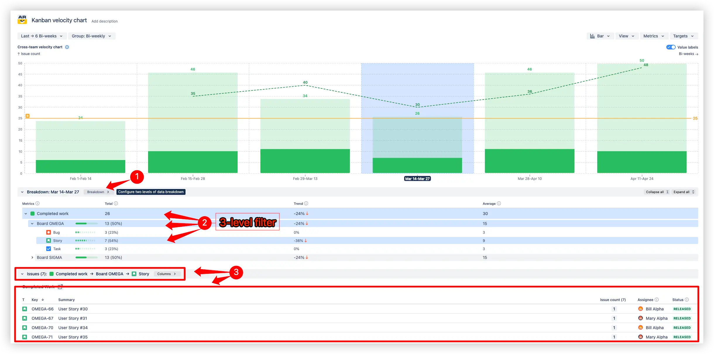
  1. Breakdown by fields: segment completed work by issue type, priority, assignee, releases, or any other Jira field.
  2. Multi-level filter: apply up to three levels of breakdown for deeper insights into velocity drivers.
  3. Completed issues list: see the exact issues under each breakdown with details like assignee, status, and direct links to Jira.
Breakdown and Issue list in Kanban velocity report in Jira dashboard

With these insights, you can:

  • Detect which types of work dominate the Kanban teams' velocity
  • Spot bottlenecks related to specific people, issue types, or releases
  • Compare performance across categories to prioritize improvement areas
  • Go from aggregated data to individual work items for full transparency

💡 Why it’s useful: Breakdowns and filters transform a simple Kanban velocity chart into a diagnostic tool. They uncover hidden patterns in your team’s flow, making it easier to act on data and drive meaningful improvements.

Additional features of Kanban velocity chart

1. Custom done statuses

Adapt the Kanban velocity chart to each team’s process by defining what “done” means on their board. Map workflow columns (e.g., Selected for Development → Released) to ensure velocity reflects real completion across different teams.

Custom done statuses settings in the Kanban velocity chart in Jira

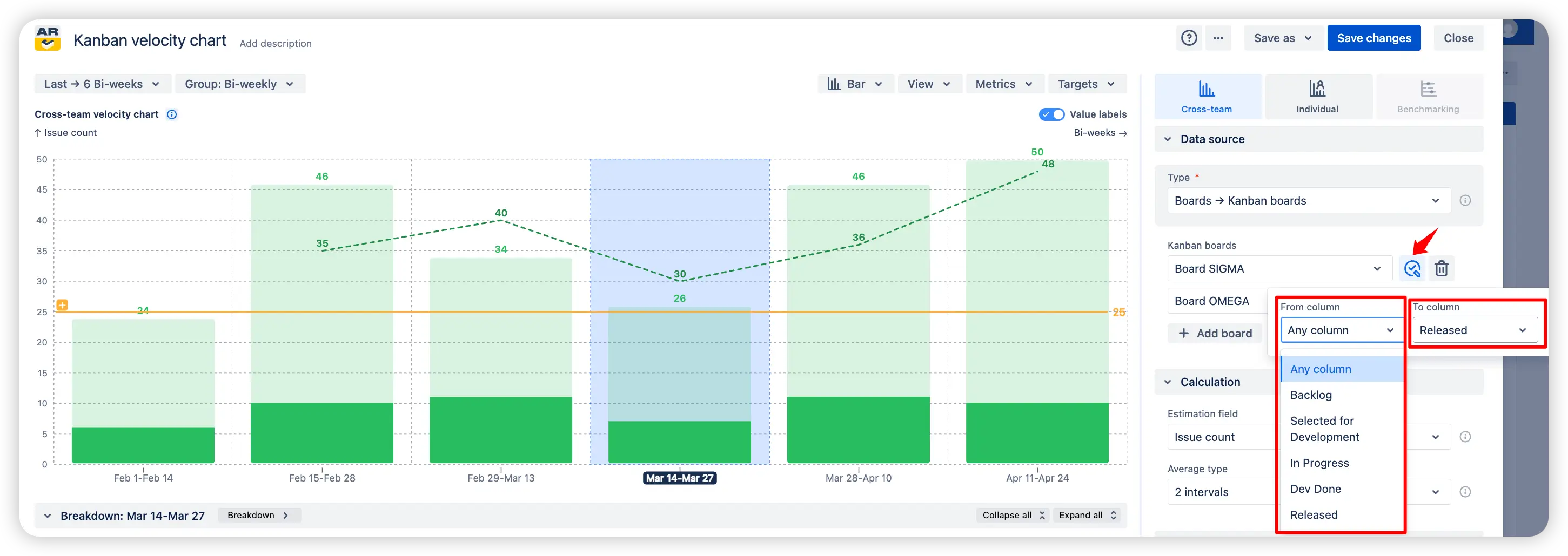
💡 Why it’s useful: Different teams often have unique workflows and definitions of “done.” Custom statuses make the chart flexible and accurate, ensuring comparisons and insights reflect reality rather than default Jira settings.

2. Time-based grouping

Visualize Kanban velocity by grouping completed work into weeks, bi-weeks, months, or quarters. This flexibility is especially valuable for Scaled Agile, where higher-level planning requires aggregated views - for example, tracking the delivery of Epics across long-term cycles.

Time-based grouping on the Kanban velocity graph example

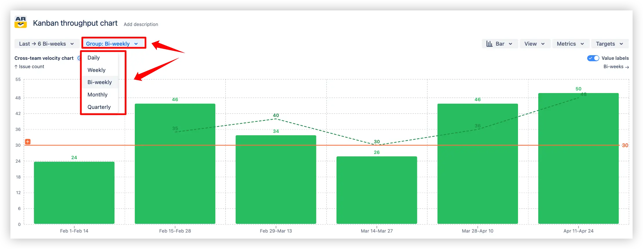
💡 Why it’s useful: Time-based grouping helps teams and leaders see both short-term delivery pace and long-term progress. Monthly and quarterly views are particularly helpful for aligning with PI planning and portfolio-level tracking.

What about native Jira Kanban velocity report

Jira does not provide a built-in Kanban velocity report. Native Jira offers only a Scrum-based Velocity report (commitment vs. completed in sprints), but there’s no equivalent for Kanban teams.

⚡ Our gadget fills that gap by offering:

📊 Kanban velocity visualization – track completed work per chosen time interval (weekly, bi-weekly, monthly)

🧠 Moving averages – smooth out fluctuations and reveal delivery trends

🎯 Target lines – set expectations or KPIs and monitor progress directly on the chart

🗂️ Breakdowns & issue list – segment by issue type, priority, or assignee, and access direct Jira links

🔍 Advanced filters – refine reports with JQL, epics, releases, or any Jira field

With these features, the gadget delivers a true Kanban velocity report, fully interactive and available right on your Jira dashboard.

Advantages of using Kanban velocity report

  • Comprehensive velocity tracking – monitor completed work over chosen intervals (weekly, bi-weekly, monthly) with moving averages, targets, and breakdowns for a full picture of team delivery pace.
  • Multi-team visibility – aggregate velocity across several Kanban boards, compare performance, and spot imbalances to adjust planning.
  • In-depth metric analysis – drill down into velocity drivers with breakdowns by issue type, priority, assignee, or releases, and inspect completed issue lists.
  • Trend visualization – use moving averages to highlight long-term delivery stability and smooth out short-term fluctuations.
  • Target line tracking – set expectations or KPIs with custom target lines, making it easy to see whether delivery meets the goals.
  • Flexible configuration – tailor reports with custom “done” statuses and advanced JQL filters to reflect real team workflows.
  • Jira dashboard gadget – add the Kanban velocity chart as a gadget to your Jira dashboard for at-a-glance monitoring alongside other reports.
  • WYSIWYG editor support – interactively configure chart appearance, metrics, targets, and breakdowns without scripting or complex setup.

With these capabilities, the Kanban velocity report turns raw Jira data into actionable insights, helping teams track real delivery velocity, improve predictability, and continuously refine processes.

Explore the interactive chart, no setup, no risk
TRY THE CHART
Chart embeded

Apps used in this Kanban velocity chart example

Take inspiration from our examples to design your own use cases directly on the Jira Dashboard.

Both Jira apps showcased here come with a 30-day free trial and remain free of charge for small teams (under 10 users):

The Agile Reports and Gadgets app includes Kanban velocity chart functionality and a wide range of additional charts and reports.

Frequently Asked Questions

1. How to track velocity in Kanban?

Unlike Scrum, Kanban doesn’t use sprints or commitments. Velocity in Kanban is tracked through the amount of completed work (issues, story points, or time estimates) over a chosen time interval (weekly, bi-weekly, or monthly, etc.).

A Kanban velocity chart by Broken Build helps visualize this pace, highlight trends with moving averages, compare performance across teams or boards, and set delivery targets for more predictable planning.

2. What is a good Kanban velocity?

A good Kanban velocity is one that stays stable and consistent over multiple intervals, showing how much work the team reliably completes. It’s not about a specific number of tasks or story points, but about a predictable delivery pace. Each team’s “good” velocity depends on its size, workflow, and capacity. The key is to maintain steady velocity trends that support realistic planning and continuous improvement.

3. How many intervals should you track to get reliable Kanban velocity?

Velocity in Kanban becomes more reliable after tracking at least 4–6 intervals, as this provides enough historical data to smooth out anomalies and reveal stable delivery patterns. In the Kanban velocity report, you can adjust the averaging method (e.g., mean, median, or selected time window) to reflect your team’s performance more accurately. With the Agile Velocity Chart Gadget, you can also filter out irrelevant statuses or boards for cleaner insights right inside your Jira Dashboard.

4. How to save the Kanban velocity chart in a Jira dashboard?

To keep the Kanban velocity chart on your Jira dashboard, simply add the Agile Velocity Chart Gadget. From there, you can choose a ready-made template or configure your own setup. The gadget can be added straight from the dashboard using the Add gadget option and selecting Agile Velocity Chart Gadget.

Why trust Broken Build apps?

Gold Marketplace Partner
apps